LTT – Rebranding
Our input
- Branding
- Branding and rebranding
- Visual identity
Client
LTT Ltd
The 90s, Estonia has just achieved independence, yet the store shelves scream emptiness. Three successful Estonian athletes who have seen the world: Tõnu Tõniste, Toomas Tõniste, and Marko Lilienthal decide to permanently change the Estonian market.
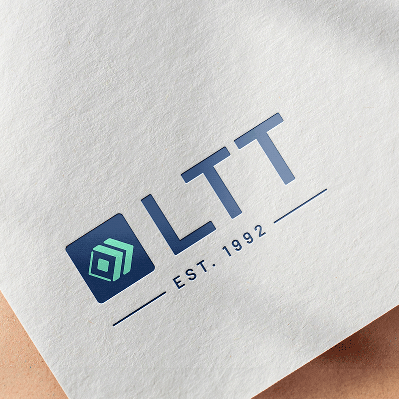
In 1992, they create the company LTT Ltd, whose name is inspired by the initials of the three athletes, and the arrival of international brands in the Estonian market had begun. LTT Ltd started calmly with chocolate, raisins, wine, and the well-known baby food brand HiPP. Everything else (from Star Dollar to Vitapress, from Bodega Norton to Agnesa, and many others) is a bright history, a successful present, and a promising future.
Problem:
Although the company’s product portfolio and customer relationships have been constantly evolving, the visual identity remained from the time of the company’s inception and needed a refresh. It was important that the rebranding didn’t erase the already accumulated brand recognition.
Our approach and solution:
We started the rebranding by studying the company’s history and the industry in detail. We identified the peculiarities inherent to the sector and the exciting background story of LTT’s establishment. In the rebranding process, we took into account the strong connection of the owners with the existing brand and sailing, important factors for gaining trust in the industry, as well as the recognition already gained. The result is a beautiful and modern visual identity, with a refreshed logo that is clean and clear.
The minimalist and spatial-looking boxes in the logo icon symbolize the company’s field of activity, the variety of products, and the diversity of products. In addition, arrows pointing in two directions represent the movement of goods and versatile communication. The founding year of the company is combined with the logo, as long-term experience is one of LTT’s strengths.
The color palette of the LTT brand is polite and lively. The special bluish-green tone adds zest to the cold blue and warmth to the orange contrasting color. Neutral tones have a balancing effect. Psychologically, each color has a different effect, creating important associations.