The problem
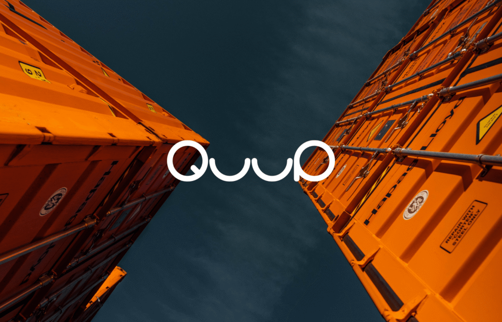
QuuP is a new storage service for people who need an affordable, convenient and secure place for their things. It started with a name and no brand. The brand had to feel optimistic and easy, but professional enough to trust with your belongings.
The solution
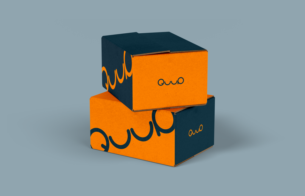
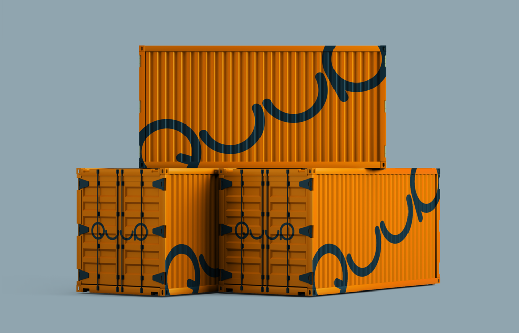
We created a mini-branding: logo, colours, typography, a favicon and examples of how the brand lives on containers and boxes. The logo draws the name in one rounded line, which adds movement to everything it sits on.
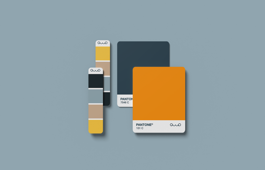
Each colour has a job. Orange brings warm, optimistic energy, toned down a little so the fun never outweighs the professional, trustworthy feel. Yellow is playful and creative, and like taxi yellow it hints at something you use when you need it. Dark blue stands for practicality, reliability and quality, while light blue adds air and calms the brighter tones. Beige adds an earthy, homely warmth.
On containers and boxes, the logo grows large and wraps around the corners, so the brand stays recognisable even when you only see part of it.
The results
QuuP got a compact brand kit that works everywhere, from a favicon to the side of a shipping container.
Client
Our Input
Visual Identity