The problem
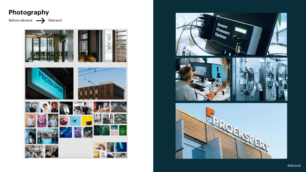
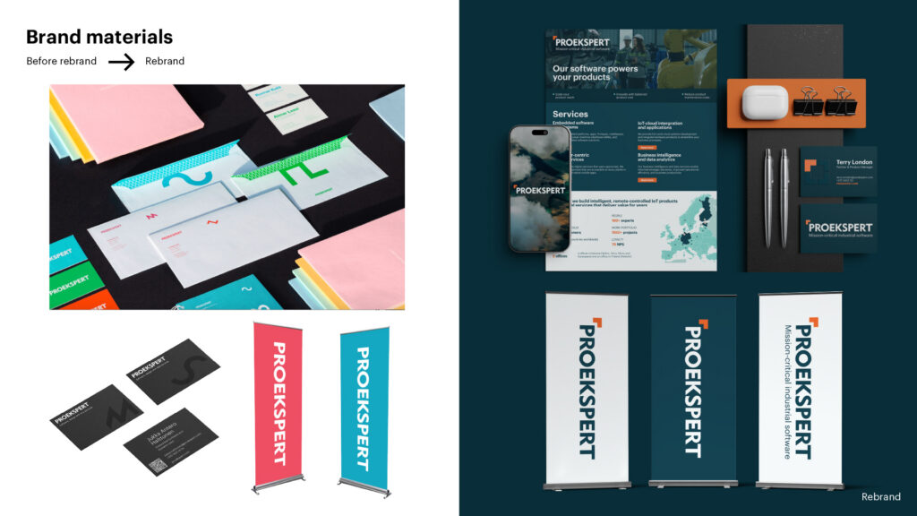
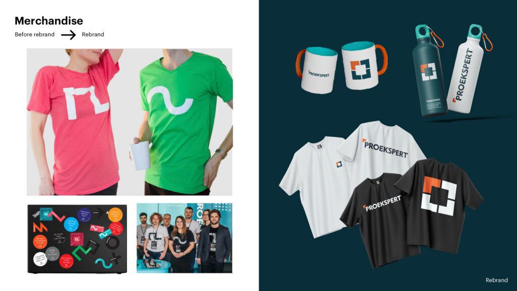
Proekspert started out in 1993 writing software for clients. Today it builds mission-critical industrial software. Every new direction along the way brought its own elements, colours and symbols into the brand. Over time the options piled up, a consistent brand language became hard to hold together, and the visuals no longer reflected the company Proekspert had become.
The solution
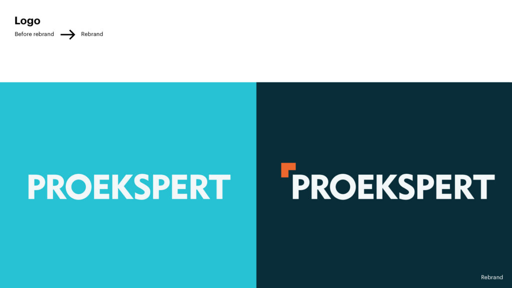
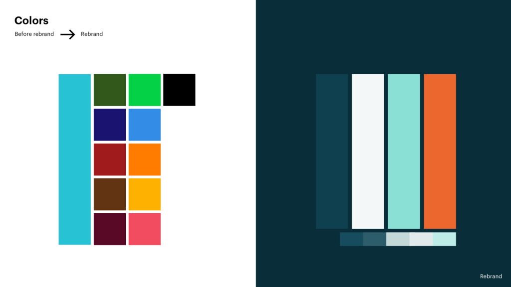
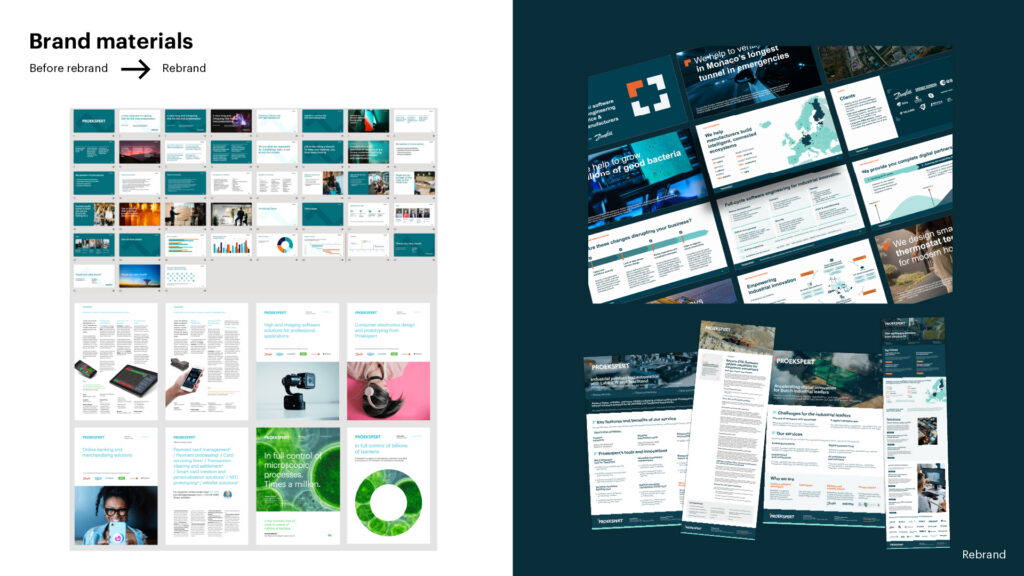
The rebrand aimed for clarity inside and consistency outside. We kept what worked in the existing identity and stripped back the rest. The familiar wordmark stayed, 13 colours were cut down to four core tones, and the whole system now builds on a single shape. The orange corner element comes from the heart of Proekspert’s work, mission-critical software engineering that keeps whole systems running. It works like a building block, and everything from the logo and patterns to presentations, print and merchandise is assembled from it. The new tagline, “Mission-critical industrial software”, sits beneath the logo.
Client
Our Input
Visual Identity