The challenge
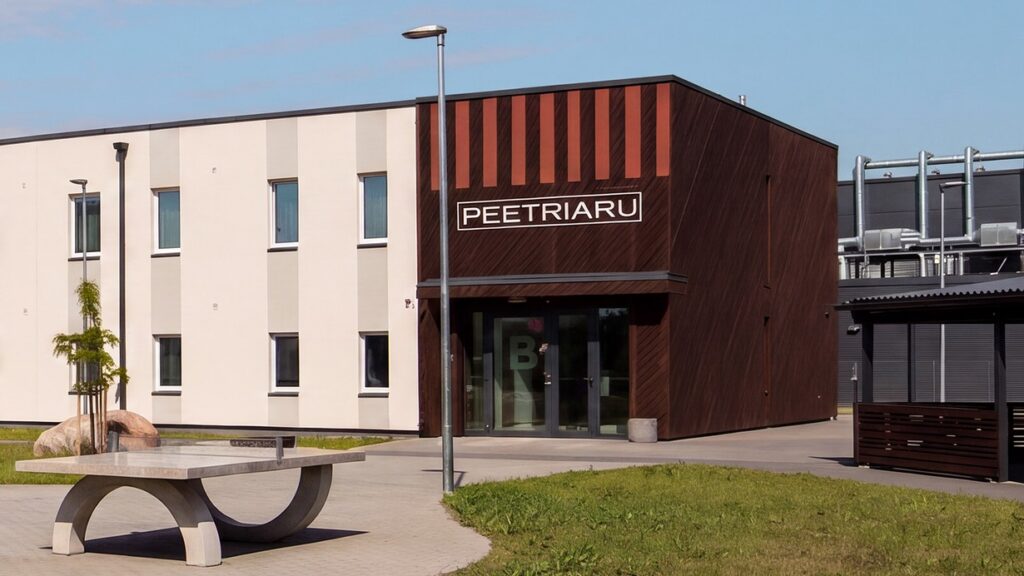
A 134-unit micro-apartment development in Peetri needed a new name and identity to replace Krati Kvartal. Both had to appeal to two very different buyers at once: young people looking for their first home, and investors looking for a steady return in an area where demand is growing. The name also had to feel rooted in the area while standing out clearly from the other new developments nearby.
The solution
We mapped the naming conventions of more than 80 new developments and researched Peetri’s historical place names, from the 1631 name Petriküll to an 1860 manor map. That gave us 130 name candidates. After a thorough selection process, we landed on Peetriaru: Peetri + aru. The name pairs a local place name with the Estonian word for good sense, which makes it a smart choice whether you’re buying a home or an investment.
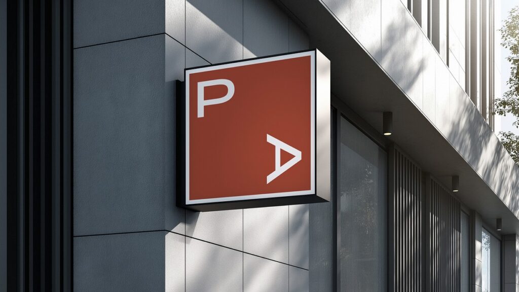
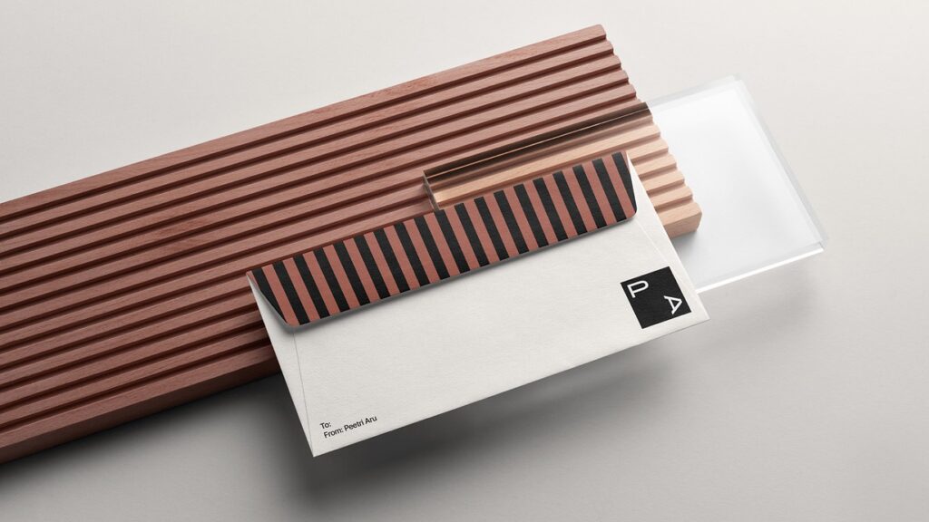
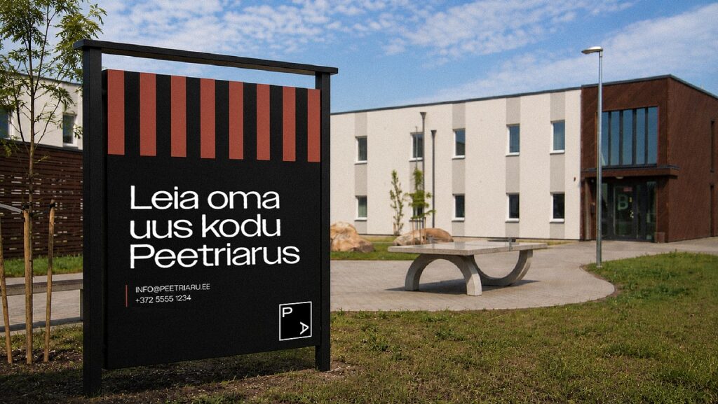
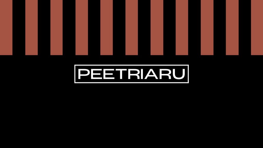
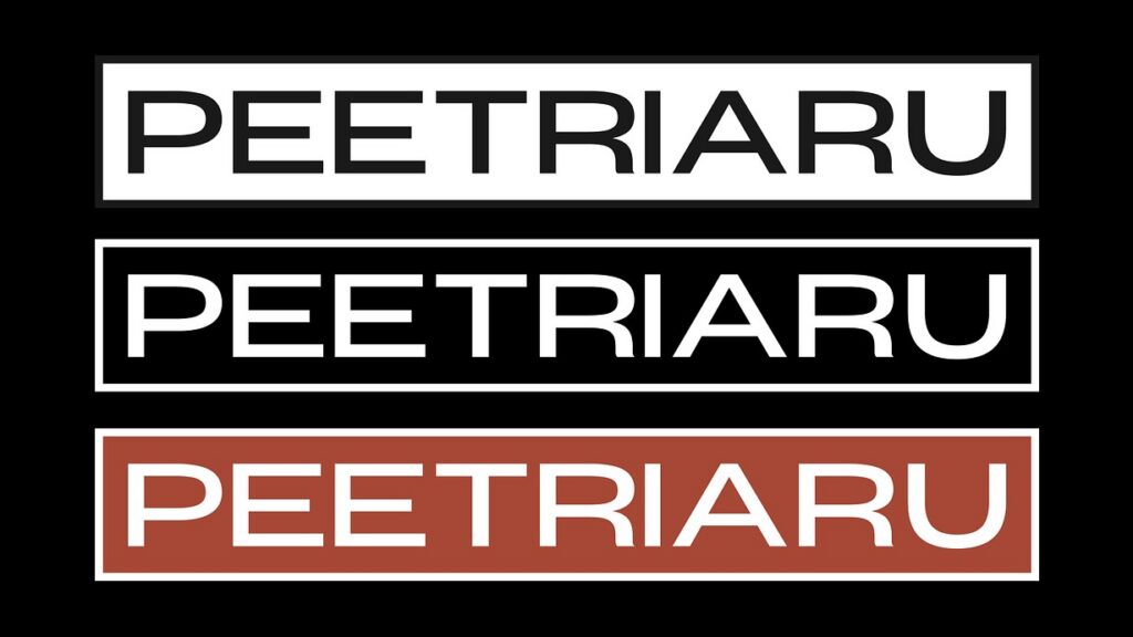
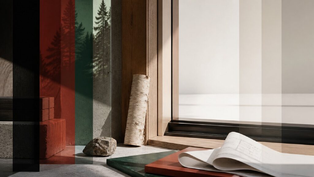
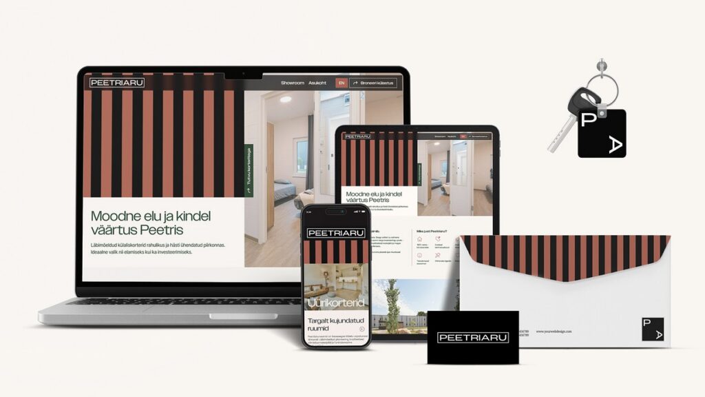
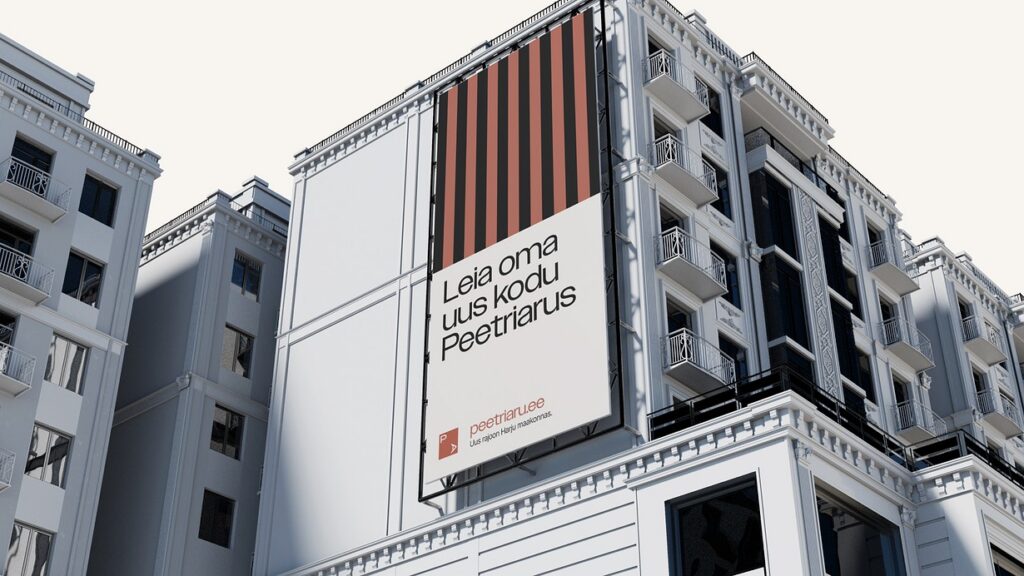
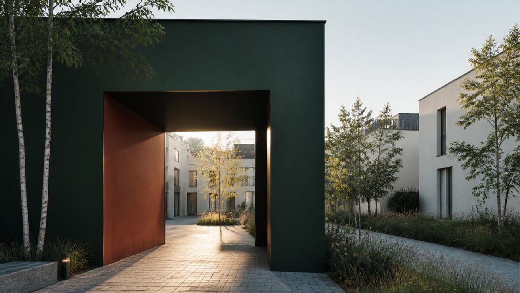
The visual identity was inspired by the building itself. Its tall, narrow windows became a vertical stripe pattern that makes the brand recognisable from a distance. A black-and-white base and a wide, all-caps logotype give investors a sense of solidity and clarity, while burnt orange and forest green add warmth for first-time buyers.
The website speaks to both audiences from the start with its core message, “Modern living and solid value in Peetri”. The showroom presents three move-in-ready apartment types, and the FAQ deals with the trickier questions upfront, such as whether you’re allowed to live in the apartment and how financing works.
Client
Our Input
Visual Identity