The problem
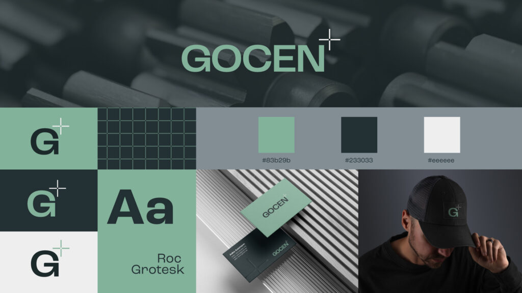
Gocen is an Estonian engineering company working in mechanical engineering, manufacturing and technical project management, both in Estonia and on the international market. Its work is built on precision, effective collaboration and systematic thinking. These values became the foundation for the new brand language.
The solution
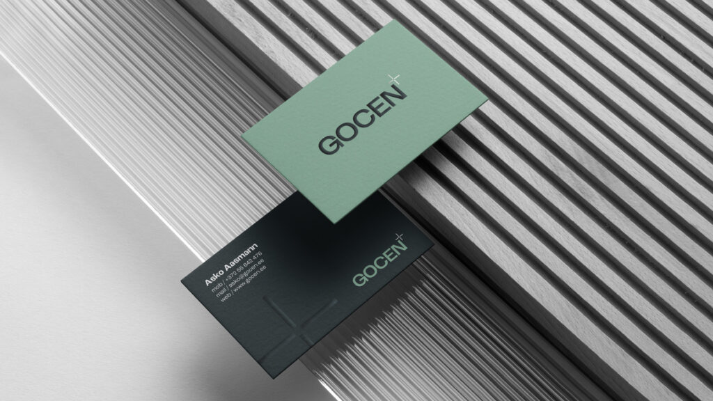
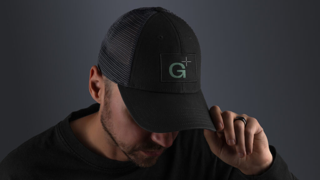
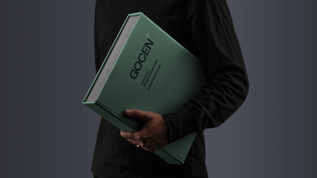
We developed Gocen’s visual identity and website to reflect engineering precision and professionalism. Gocen offers a service that is unique in Estonia, combining technical expertise and project management at a high level. That is why we made a conscious choice of granite green as the brand colour. The tone is unconventional in the industry, and it emphasises the company’s distinctive position and reliability. The new brand is clear, balanced and trustworthy, just like the company itself.
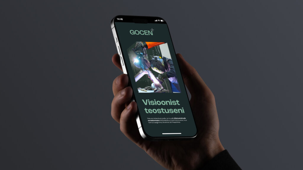
The design and development of the website moved hand in hand, like a well-functioning mechanism. The goal was an environment that is simple yet clearly conveys quality and precision. Every animation and interactive element was carefully considered to support a seamless user experience.
The results
The result is a carefully designed visual system and digital experience that support Gocen’s growth strategy and present the brand as a strong, modern partner in the industrial world.
Client
Our Input
Visual Identity
Web Development
Websites