The problem
Wild&Mild makes nail polishes, UV gel polishes and nail art products for doing your nails at home. The name already held two sides. The rebranding had to bring out both and encourage people to appreciate their real selves, bold one day and calm the next.
The solution
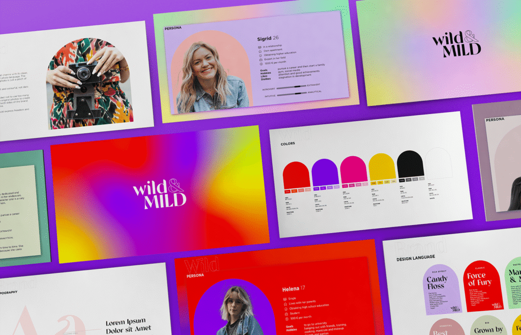
We built the brand around two best friends. One is a bit wild and loves adventure, the other is more timid and values safety. They appreciate each other’s differences and stick together every step of the way. The brand idea: a meeting point for wildness and tranquility. Wild and crazy on one hand, calm and gentle on the other, according to the tone and the mood.
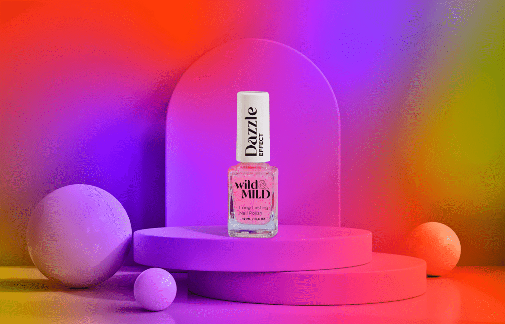
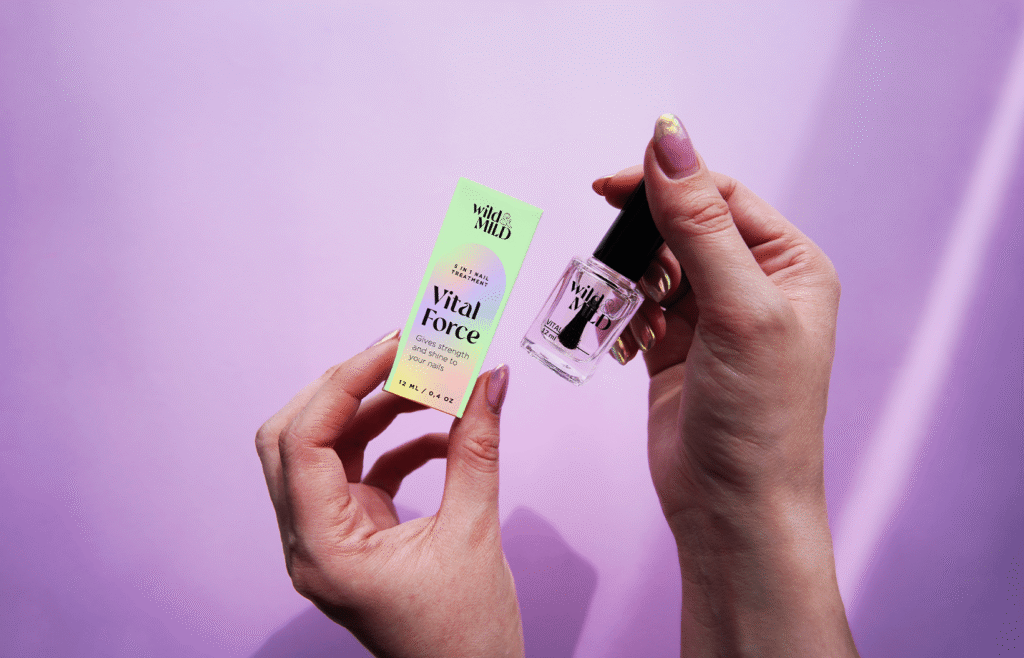
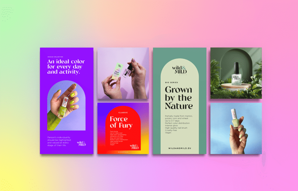
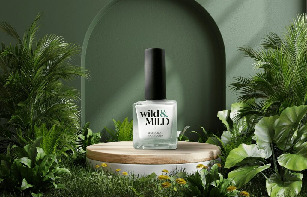
The logo pairs a lowercase “wild” with a capital “MILD”, joined by an ampersand. Two gradients carry the two moods: hot purples, reds and yellows for the wild side, soft pastels for the mild side. An arch frames products, photos and text on packaging, social media and the website. Lines like “Force of Fury” and “Grown by the Nature” follow the same split.
The results
The two friends still lead the brand story on wildandmild.eu today. The website and webshop we built on the new brand reached the shortlist in the website category at Kuldmuna 2023, the Golden Egg awards.
Client
Our Input
Visual Identity