The problem
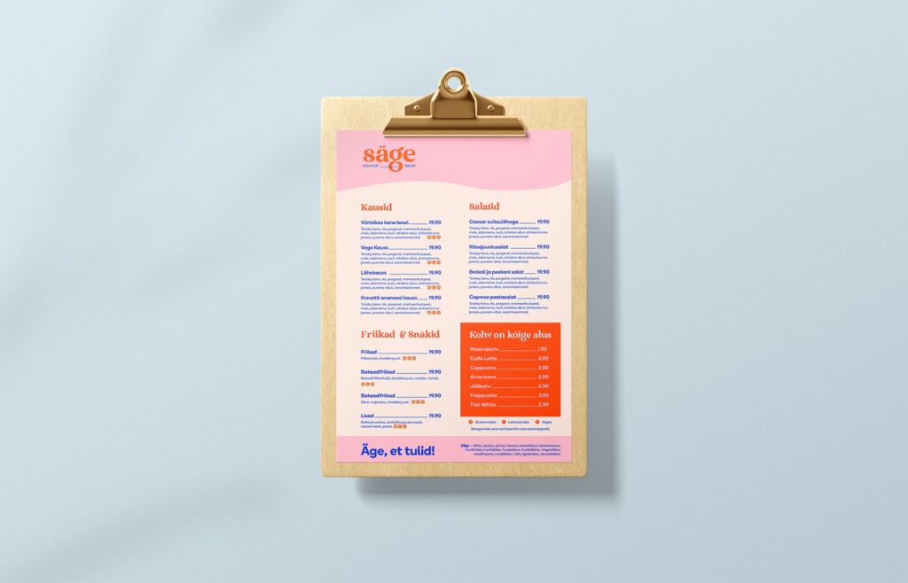
Säge is a café-bar for the people of Veskimöldre and Laagri, just outside Tallinn. It shares its space with Pappa Pizza. The challenge was to give Säge a clearly distinctive identity of its own, while the Pappa Pizza side stayed as it was. Säge had to become a place where locals drop in for cake, good coffee and light bites. It is also where they meet up or work remotely over a coffee. In the evening, it serves cocktails, wines and dinners with friends.
The solution
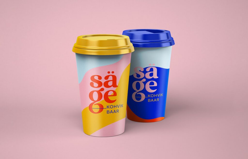
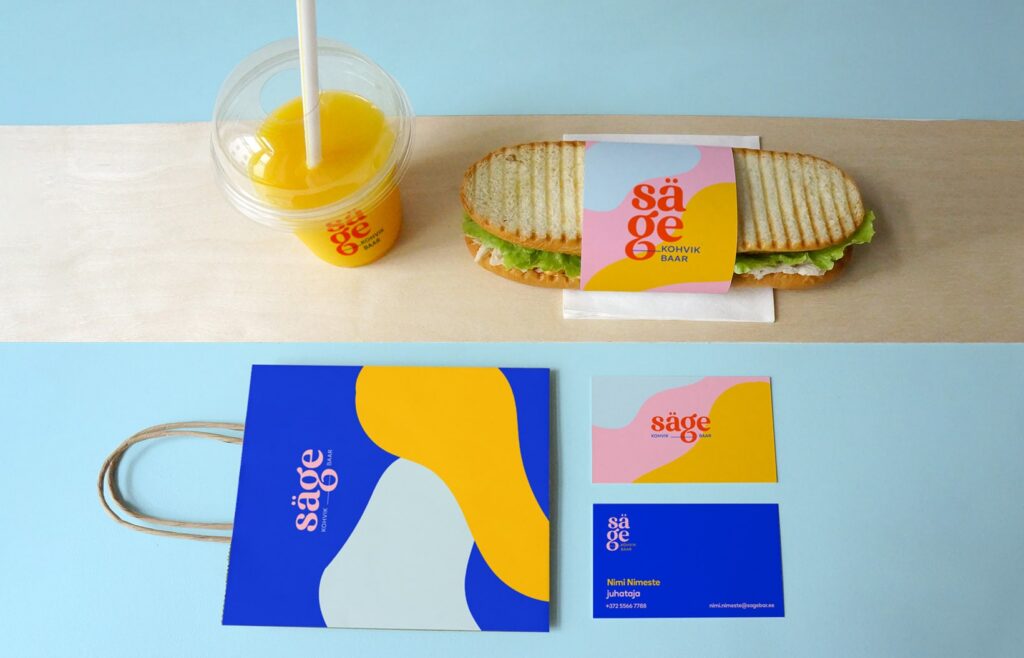
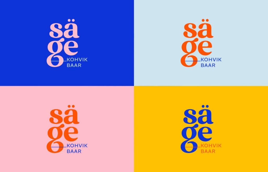
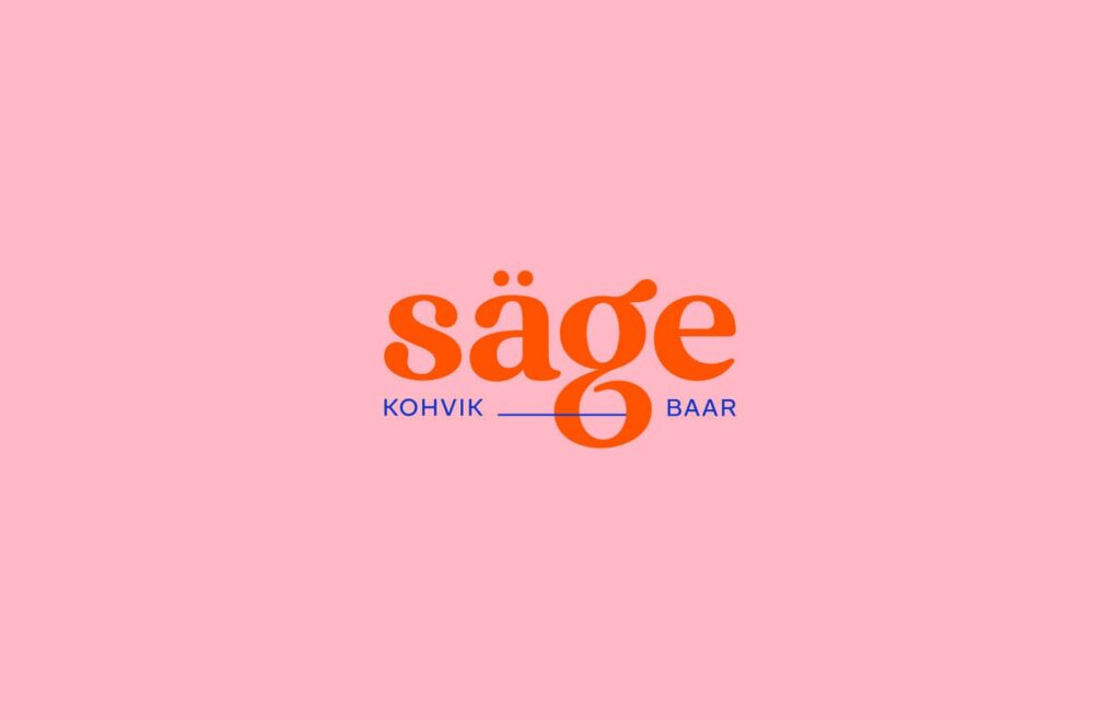
The name Säge means captivating, enticing and delicious. In 2020, we created a mini-branding with bright, happy colours that capture the spirit of the place. Extraordinary typography seals the deal. The identity draws a clear line between Säge and Pappa Pizza within the shared space.
The results
A distinctive brand that gives Säge its own personality next to Pappa Pizza. In our view, it holds its own against the cafés of Tallinn’s Telliskivi Creative City at the time.
Live website: sägekohvik.ee
Client
Our Input
Visual Identity