Background
Noorte Investeerimislaager is aimed at high school students to help develop their financial literacy and investment skills. The goal of the camp was to create a brand that would be youthful and engaging, yet trustworthy and professional, encouraging young people to take their financial education seriously.
Challenge
The objective was to create an identity that balanced the seriousness of learning with the enthusiasm of youth. The task required a visual language that would inspire trust and create an appealing environment for young people.
Solution
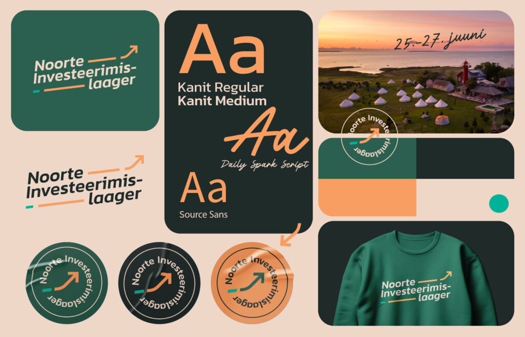
We drew inspiration from the “Sage” archetype, representing wisdom and calm, to reflect the camp’s mission of supporting youth education. The color palette combines shades that emphasize a balance between professionalism and youthful energy. The logo and graphics were designed to be playful yet responsible, aligning with the values of financial knowledge and responsibility.
Visual Identity
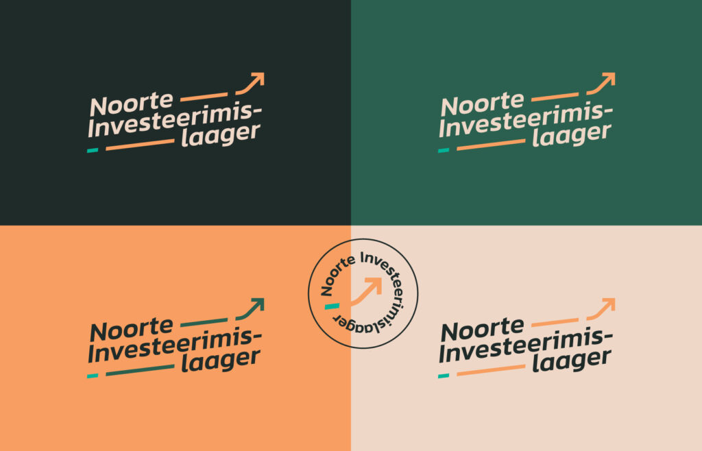
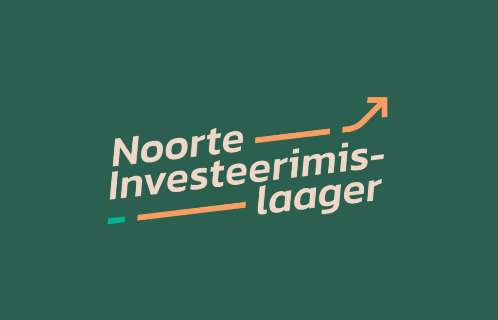
•Logo: A logical and minimalist logo design symbolizing the journey of growth and learning.
•Colors: Professional yet youthful tones that create an inviting atmosphere and reinforce reliability.
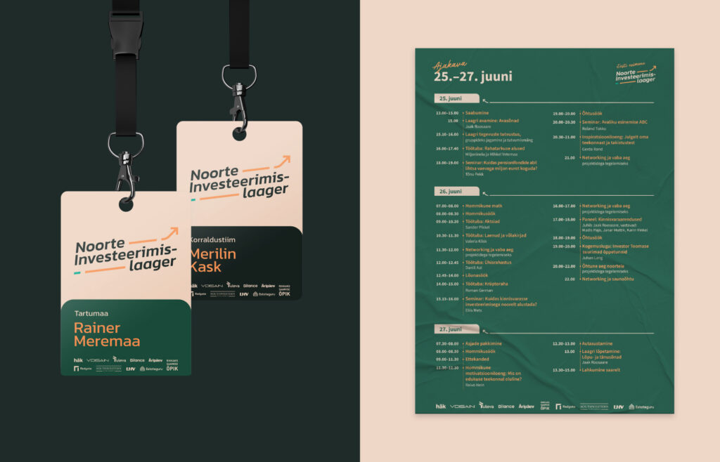
•Graphics: Geometric elements and dynamic patterns were used to connect the brand identity to the dynamic world of investing.
Result
The Noorte Investeerimislaager brand received a positive response, attracting a large number of interested young people. The visual identity effectively supported the camp’s message and goals, providing high school students with an inspiring and professional platform to build their knowledge and skills.
Client
Our Input
Visual Identity