Belief water rebrand
Category
- Branding
- Branding and rebranding
- Visual identity
Client
Belief Water
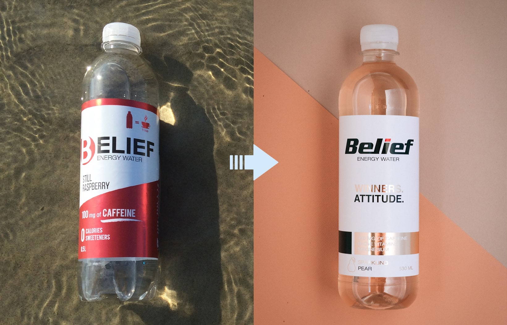
In early 2019 Belief came to us with one clear brief: refresh the visual identity and product packaging design of a caffeinated energy water aimed at millennials.
The product had been on the market for a couple of years and it worked. But the first-generation packaging was built before the brand knew exactly who it was and who it was talking to. On the shelf, it disappeared.
Key challenges
- The energy drink shelf is one of the loudest in retail, and Belief did not stand out on it.
- The visual language did not speak to the audience the product was actually made for.
- The pack had no hierarchy: what it is, which flavour, why it is different.
- There was no system to carry new flavours and new languages without starting from zero each time.
Solution
We started with positioning. Belief does not compete on volume. It wins on clarity. That became the governing principle for every design decision.
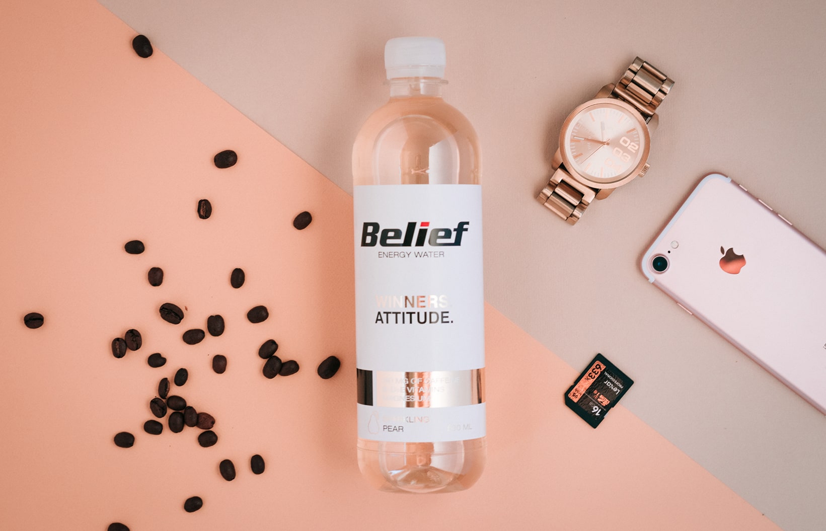
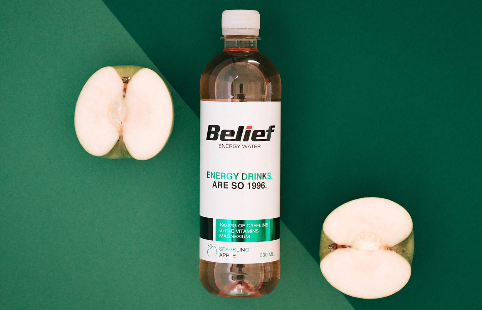
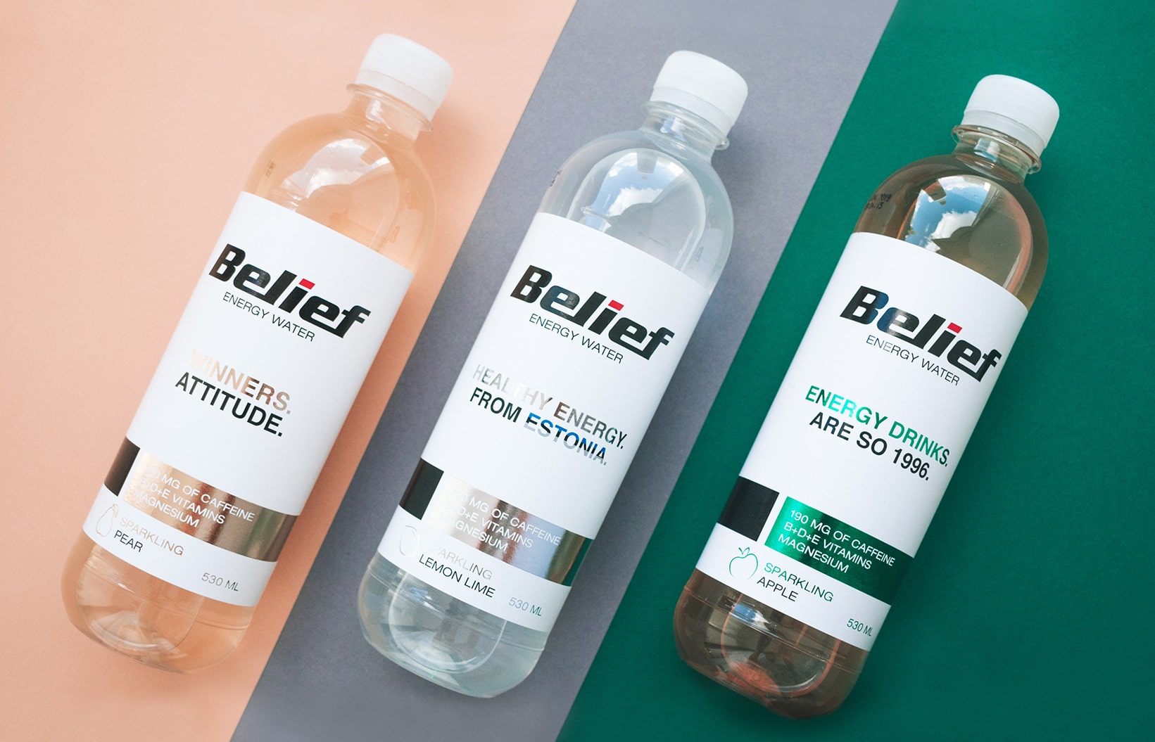
We built a packaging system with a simple, strict logic: a confident wordmark, a clean white label, one colour per flavour and a short line of attitude instead of a list of claims. The information is ordered so a shopper reads three things in a second. What it is, which flavour, and how it differs from a conventional energy drink.
A system that scales
The important decision was not the design of one bottle. It was the framework.
A new flavour means a new colour and a new name inside the same grid, not a new design project. A new market means another language on the same surface, without the composition falling apart. That is what makes design an asset rather than a cost.
Result
The system created in 2019 is still in use. New flavours and new languages have been added on the same platform ever since, with no rebrand in between.
The company grew alongside it. According to Estonian business registry data, Belief Water OÜ turnover was 283 thousand euros in 2019 and 4.1 million euros in 2024. The brand carried that growth without having to reinvent itself.
That is the real measure of a durable brand platform. Good packaging design is not a picture on a bottle. It is a system that holds up across years, dozens of product variants and several markets.