Tiskre Kool visual identity
Category
- Branding
- Branding and rebranding
- Visuaalne identiteet
- Visual identity
Client
Tiskre Kool
Problem
School’s interior design was made on assumption that the building would become a combined kindergarten and school. By the time we started, the plan had changed: no kindergarten, and Tiskre School would be a primary school for grades 1-6. What was needed was an identity that worked with the interior already in place and that a primary-school child would take on with pride.
Solution
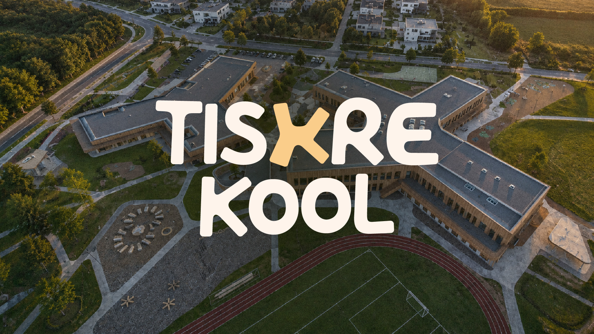
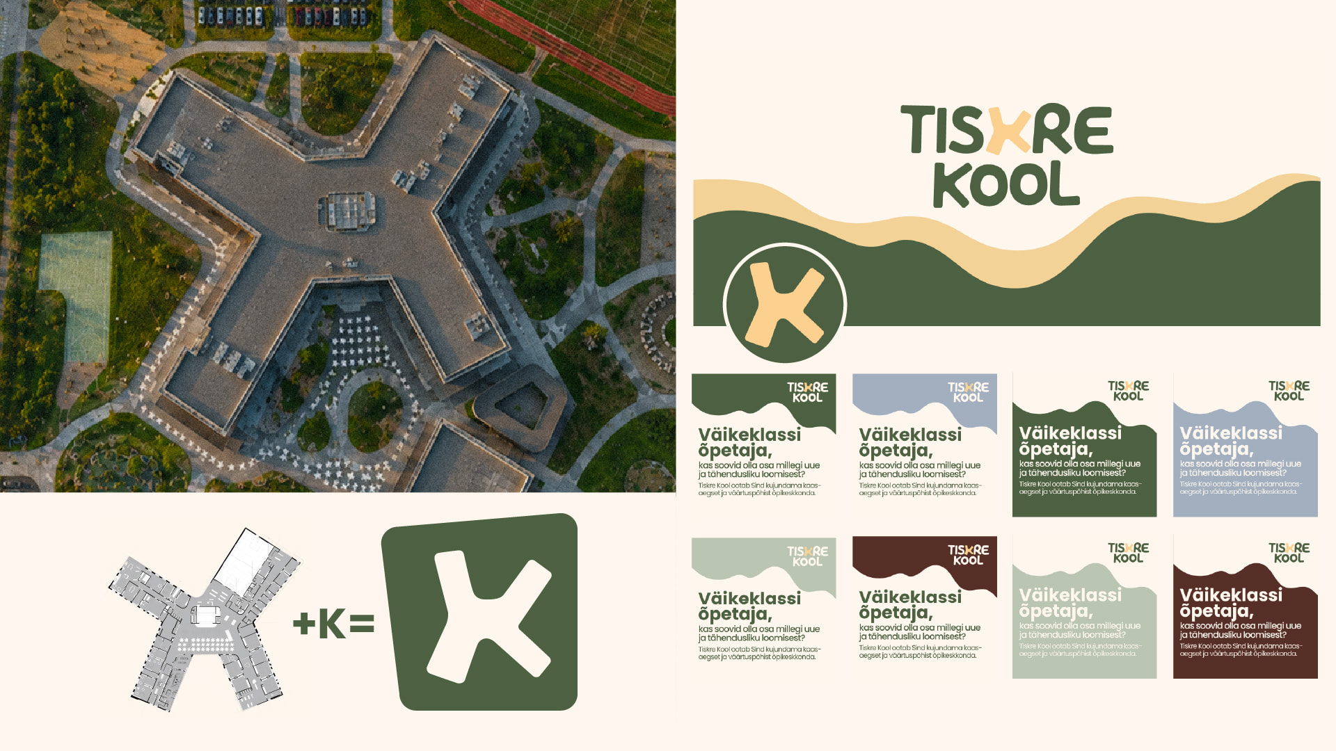
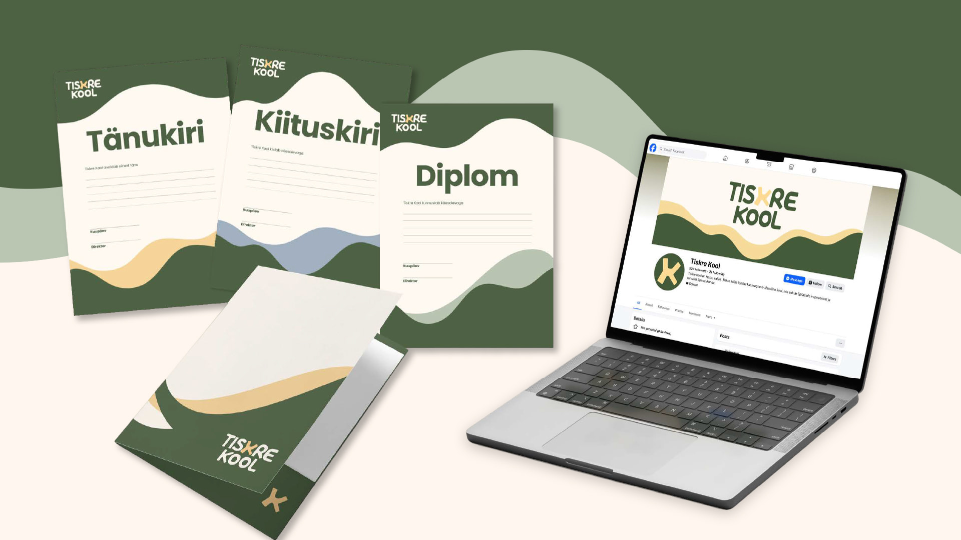
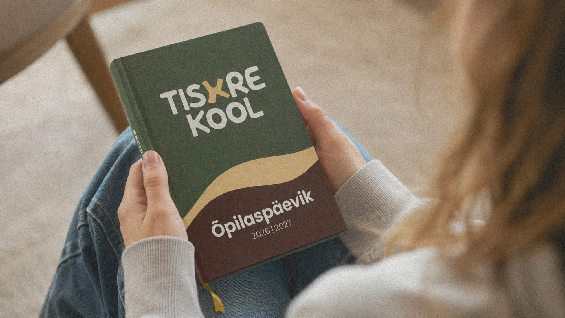
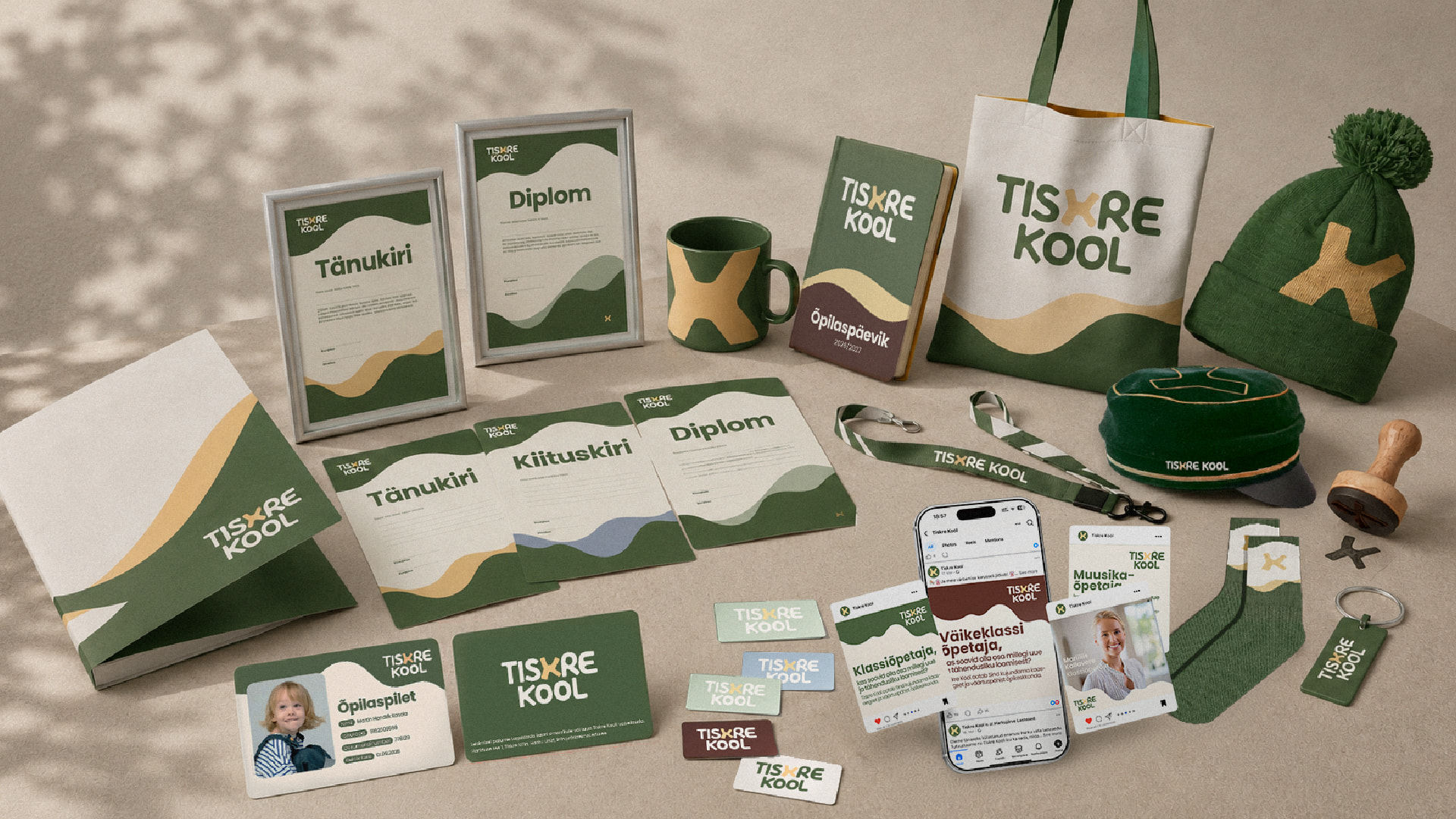
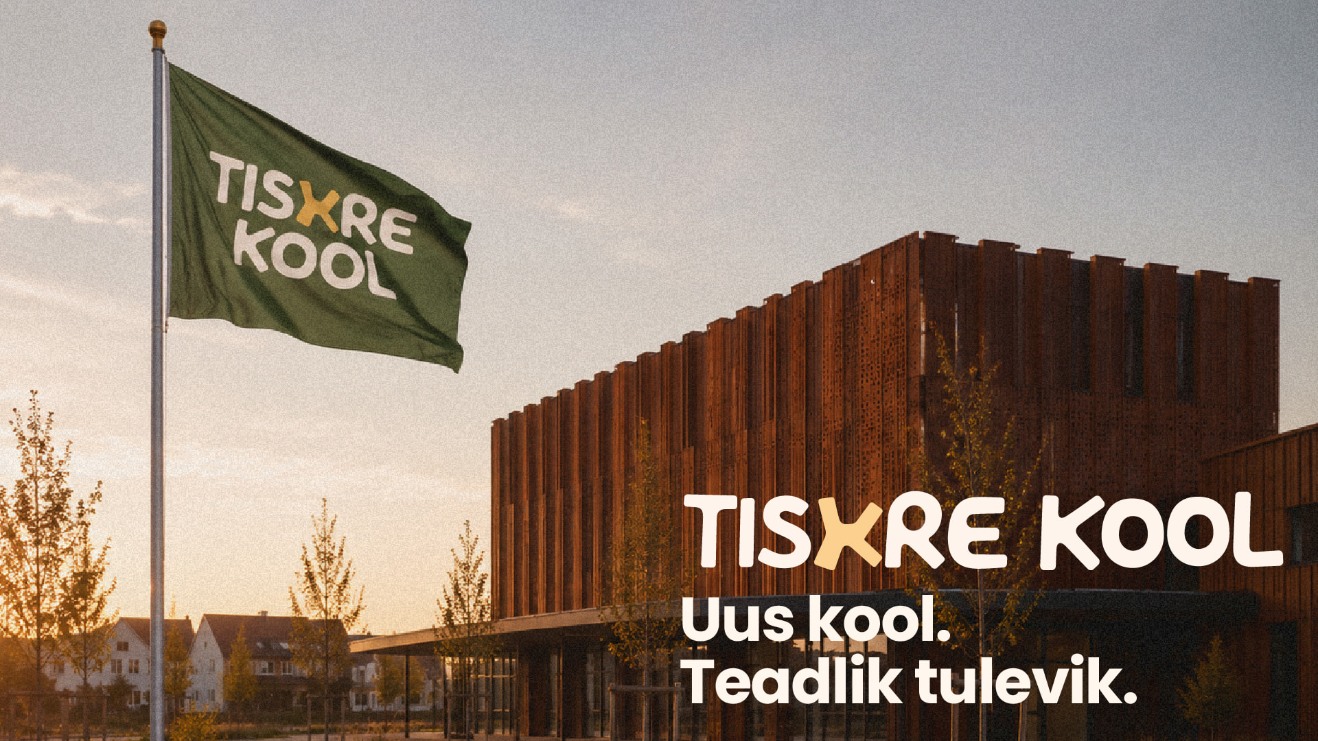
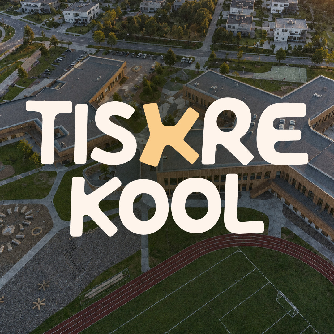
The visual system started from the architecture: seen from above, the four wings of the building form the letter K, and from that grew the logo and the central shape of the identity. The same geometry recurs in the typography, the graphic elements and the applications, tying the school’s name, the building and the visual language into one whole.
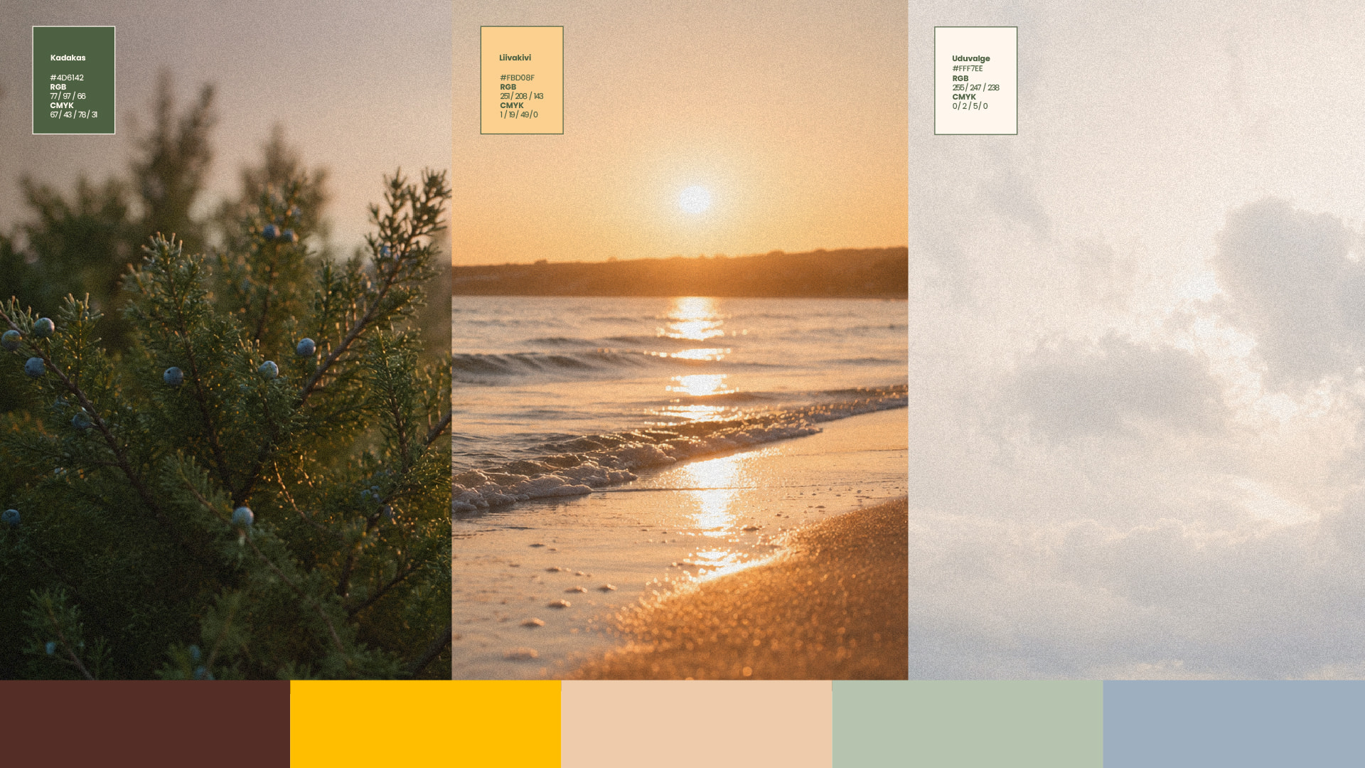
The colour palette draws on the nature around Tiskre. A graphic wave motif points to the sea nearby and to the wind the area is known for, which gives the place its rhythm and character. Together these elements make for a calm, contemporary and timeless identity.
The result is a visual system that gives the new school more than a recognisable face – it lays a solid foundation for a community to form before the first school bell rings.