Success Story
5
languages on Kaluri labels
The problem
Kaluri is the fish brand of Läätsa Kalatööstus, a fish processor on the Sõrve peninsula in Saaremaa. In 2023 Kaluri launched a new line of fried and spiced sprats. On the shelf it met a market leader that many shoppers had been buying for twenty years. The new labels had to make those shoppers reach for Kaluri instead, almost out of habit.
Kaluri had one clear advantage: 500 g of fish in a tub the same size as the one where the leader sold 430 g.
The solution
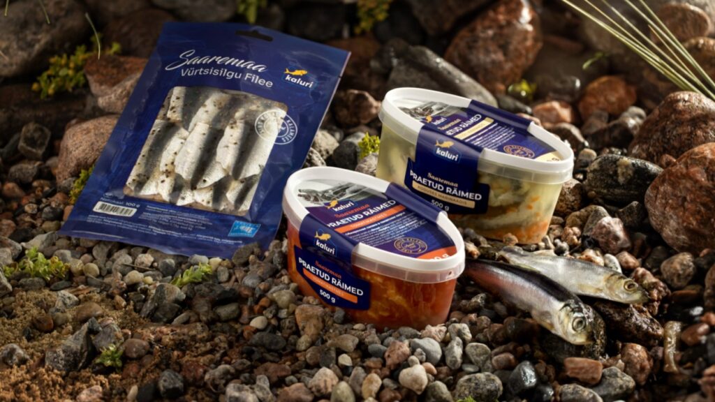
We designed a label that feels familiar at first glance and then gives clear reasons to switch. Saaremaa sits on the front, each flavour has its own colour band and 500 g is printed large. The first labels wrapped over the lid with tabs on both sides and were applied by hand, with product names in Estonian and Russian.
In 2024 Kaluri installed a new labelling machine. We rebuilt the system as two-layer peel-back labels with an “open here” notch and moved the range across without losing the look.
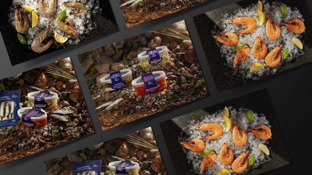
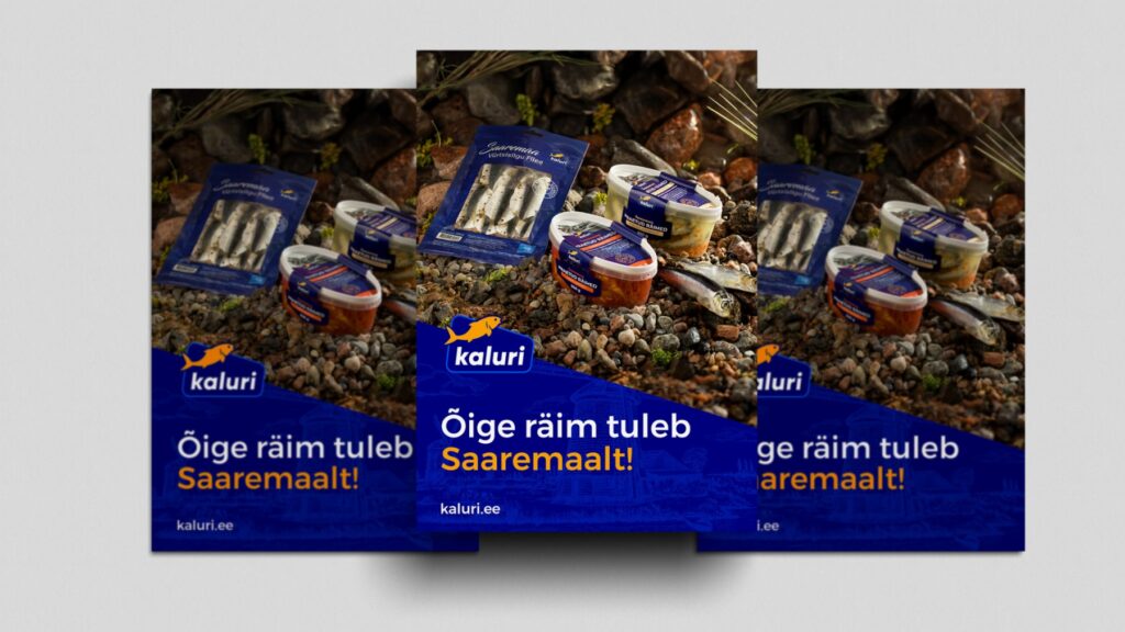
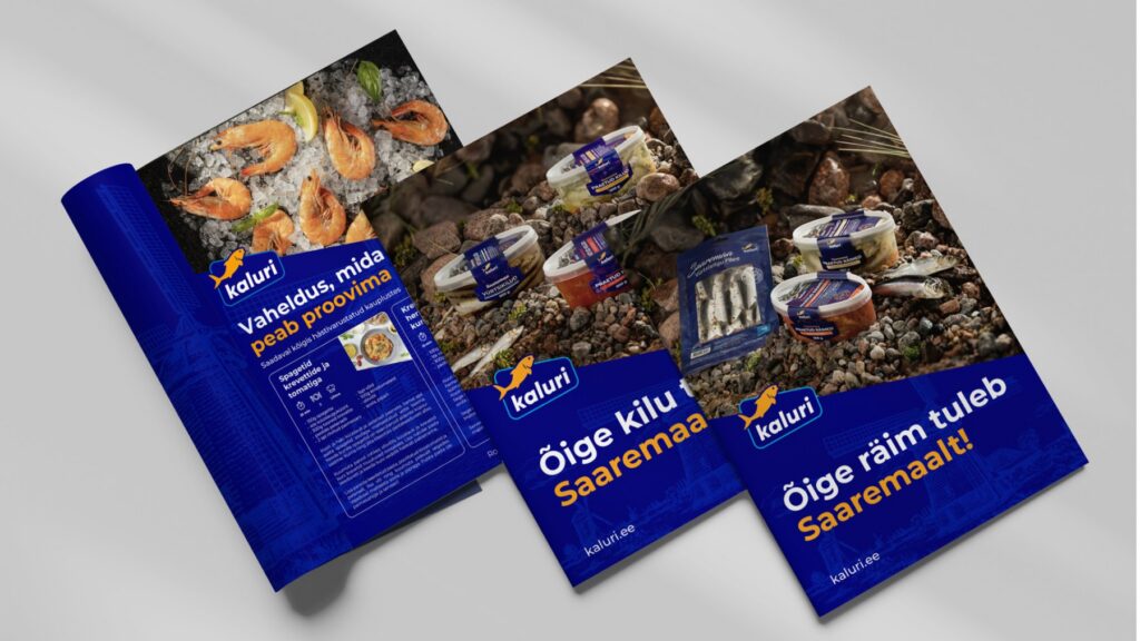
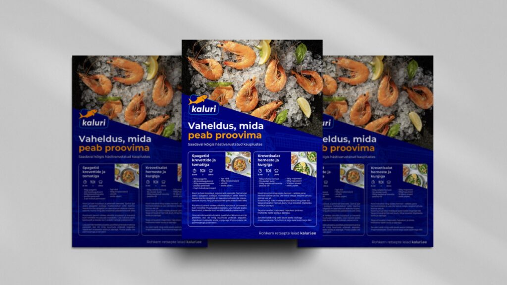
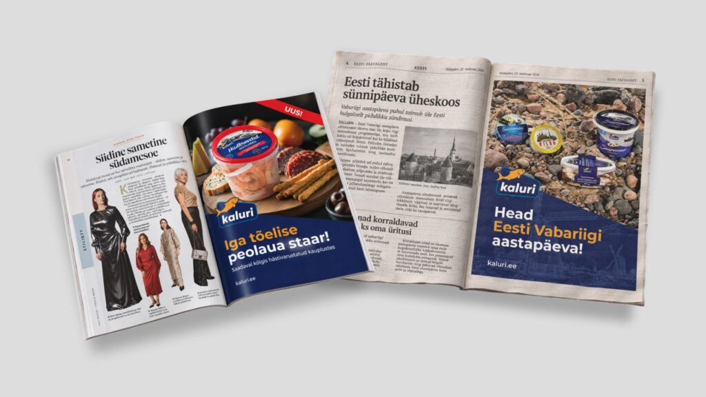
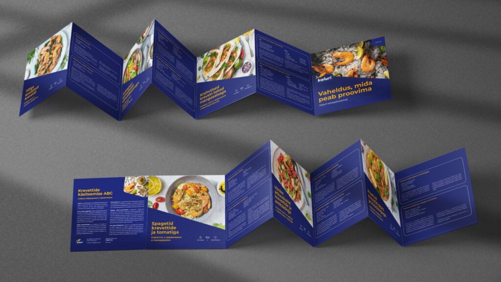
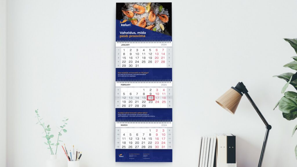
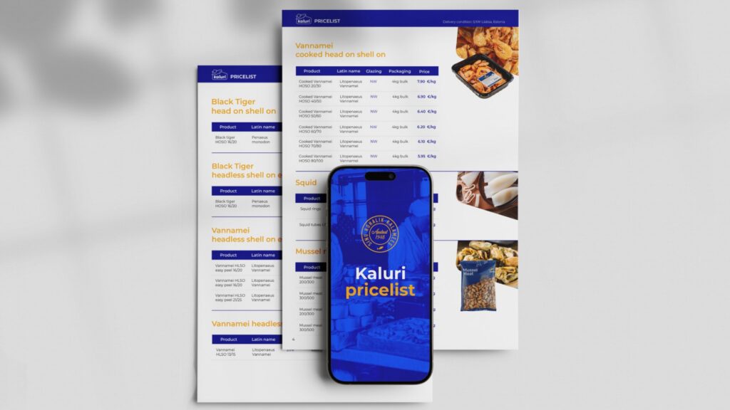
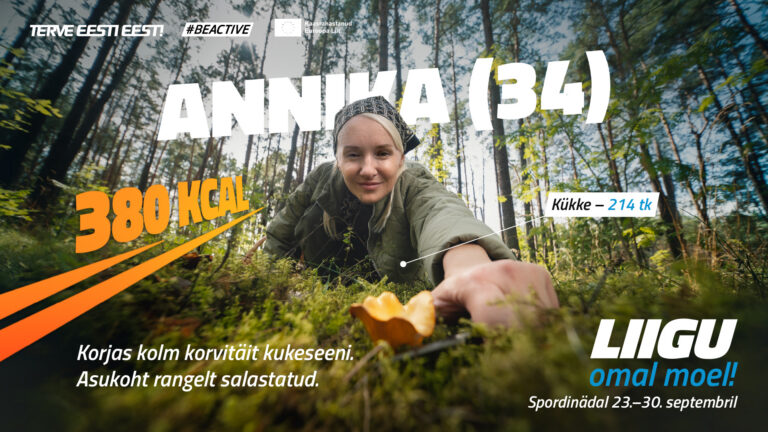
The same system then took in Baltic herring, herring fillets, shrimp buckets and trout roe. Shrimp bucket labels now also run in Latvian, Lithuanian and Ukrainian. Around the labels we built campaigns for herring, sprats and shrimp: posters that say “Õige räim tuleb Saaremaalt!” (real Baltic herring comes from Saaremaa), recipe leaflets, print ads, a calendar and a price list.
The results
Kaluri products are on the shelves of all major grocery chains. Since 2023 the label system has carried the brand through a new production line, new product families and labels in five languages.
Client
Our Input
Label design
Packaging system
Campaigns
Print design