Rebranding of Saue State High School
Our input
Rebranding
Client
Saue State High School
Saue State High School approached us with the need to update its visual identity. Although the school is relatively new and was initially given a fresh and youthful brand, it soon became clear that the design didn’t fully reflect the school’s real character, values, or academic strength.
The school positions itself as a serious, future-focused learning environment that offers students flexible and high-quality study opportunities, including partnerships with universities and other education institutions. The goal was to create a visual language that would be trustworthy, academic, and still appeal to young people.
Main challenges
- The visual identity didn’t align with the school’s architecture or values.
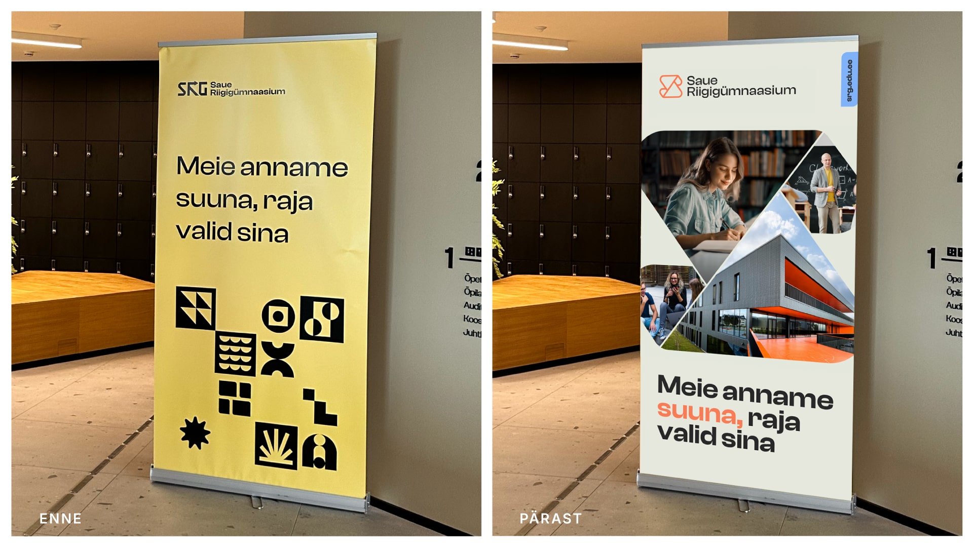
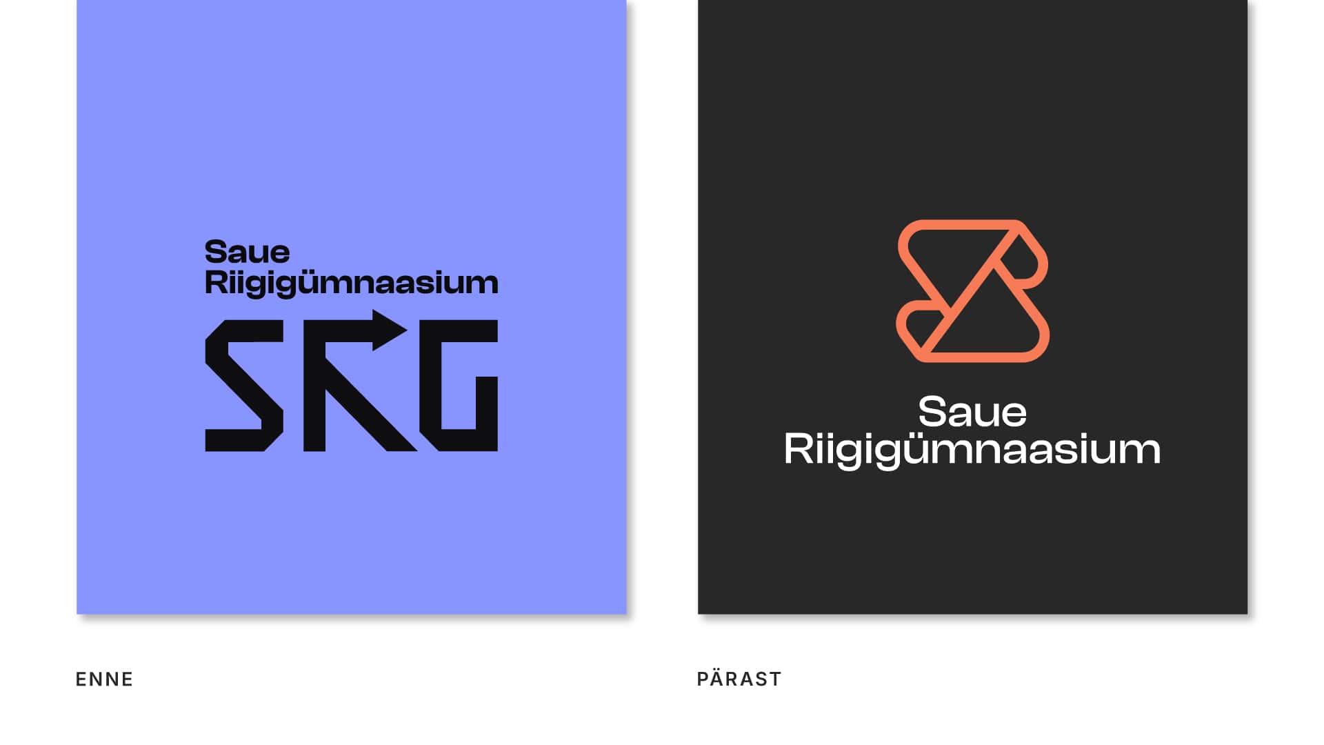
- The color palette (especially purple) didn’t reflect the school’s emotion or translate well into printed materials – one of their main communication tools.
- The logo and abbreviation “SRG” were too complex and hard to read.
- The school wanted to stand out among competitors and build a more professional and reliable image.
Our approach
We started with a deep strategic analysis – learning about the school’s curriculum, values, and audience.
The school building is its heart, so we felt a strong responsibility to ensure the new visual identity would reflect the architecture and share its rhythm. Our main inspiration came from the building’s color scheme and interior details, such as the soft shapes and rounded corners.
Based on this, we redesigned the entire visual identity to reflect the school’s true nature – academic, modern, trustworthy, yet youthful and full of energy.
Logo
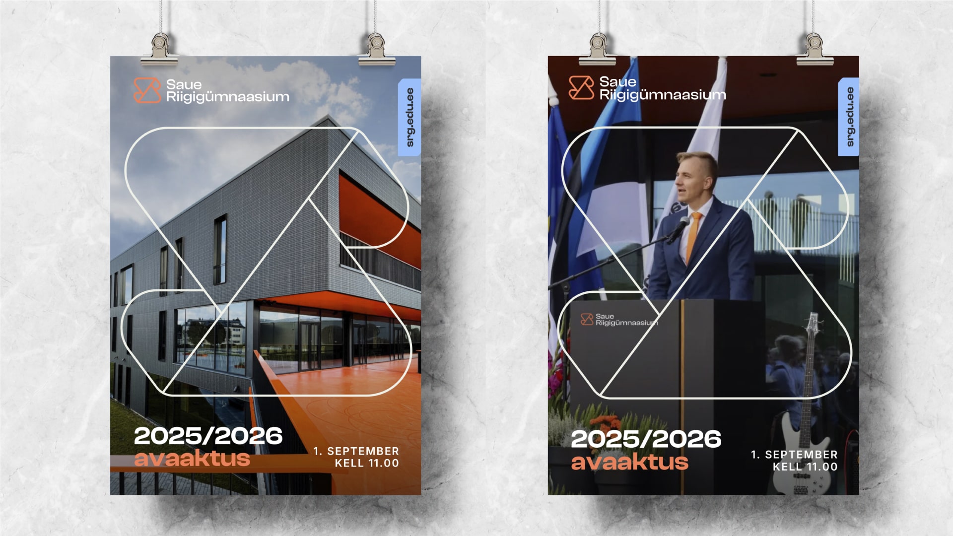
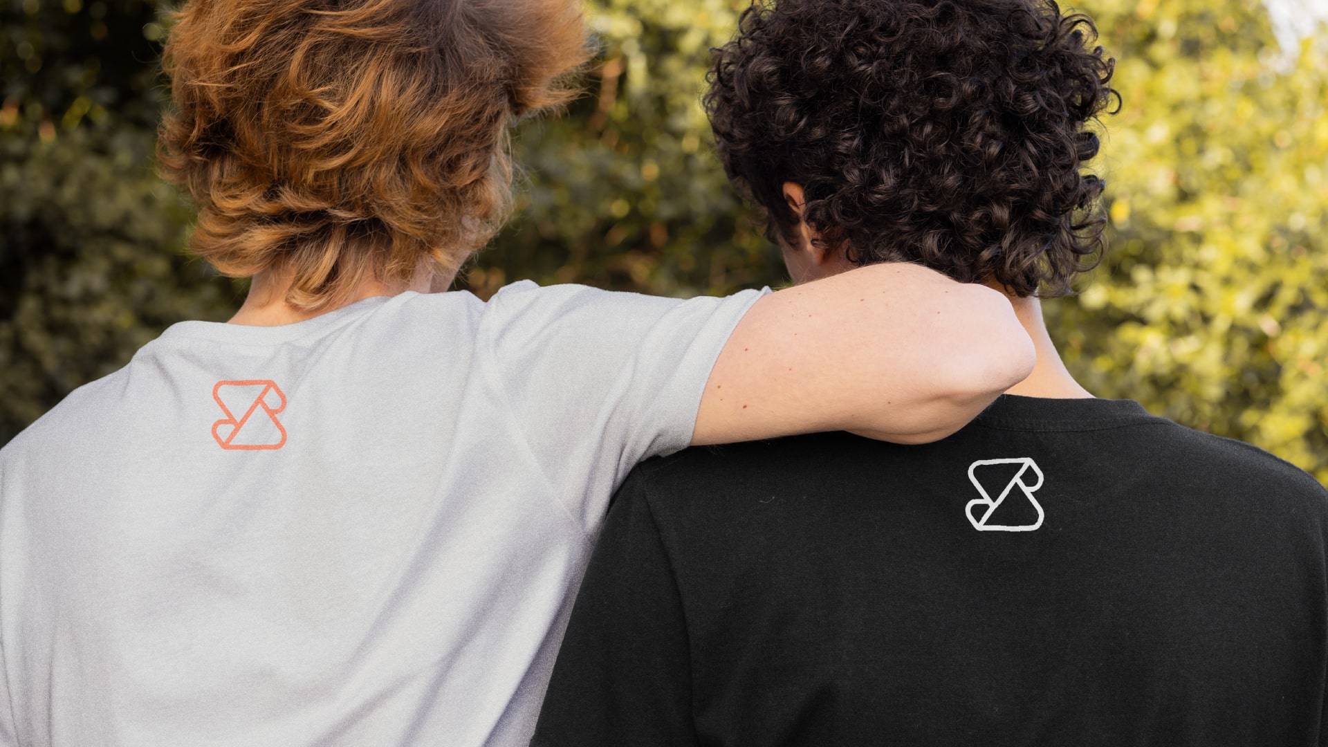
The new logo is based on a stylized “S” folded in an origami-like form. It represents a student’s learning journey and the many choices available to them. The geometric shape symbolizes planning and precision, while the rounded corners add a friendly and approachable touch.
The logo icon is a dynamic element – it can appear as a pattern, a photo frame, or a graphic detail, helping to create a strong and cohesive visual system.
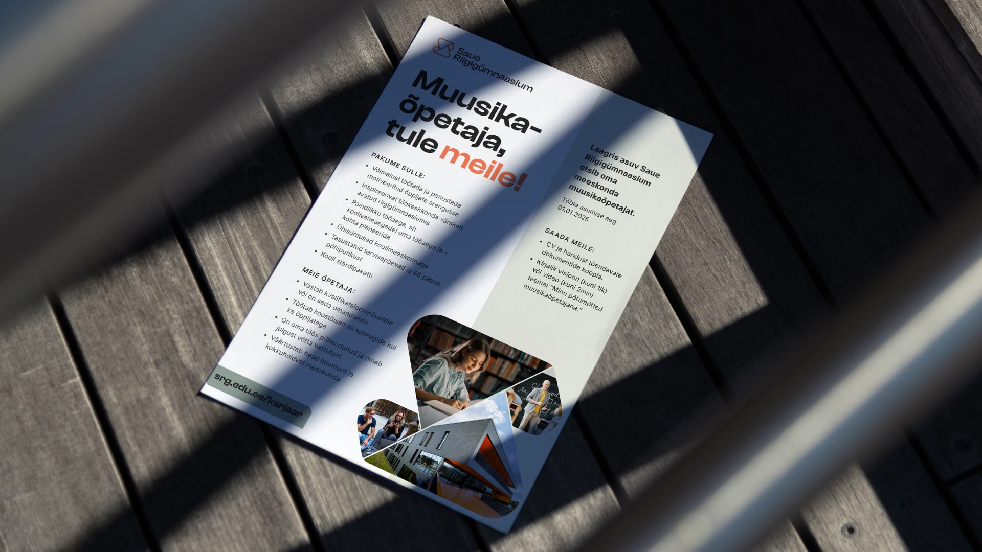
Color palette
The color concept was inspired by the school building’s exterior – mainly black and orange – complemented by the natural feel of light green and wood tones used inside. The new visual language is a direct extension of the building’s architecture and strengthens the overall brand. The colors follow a clear hierarchy and work well in both print and digital formats.
Saue State High School’s new visual identity is a great example of how branding should support an organization’s strategy, values, and everyday experience.
We didn’t just design a new logo – we helped the school create a clear, professional, and inspiring visual language that tells their story with confidence.