Collaborative Brainstorming
We held brainstorming sessions with the Mobifer team to understand their core values, target audience, and business goals.
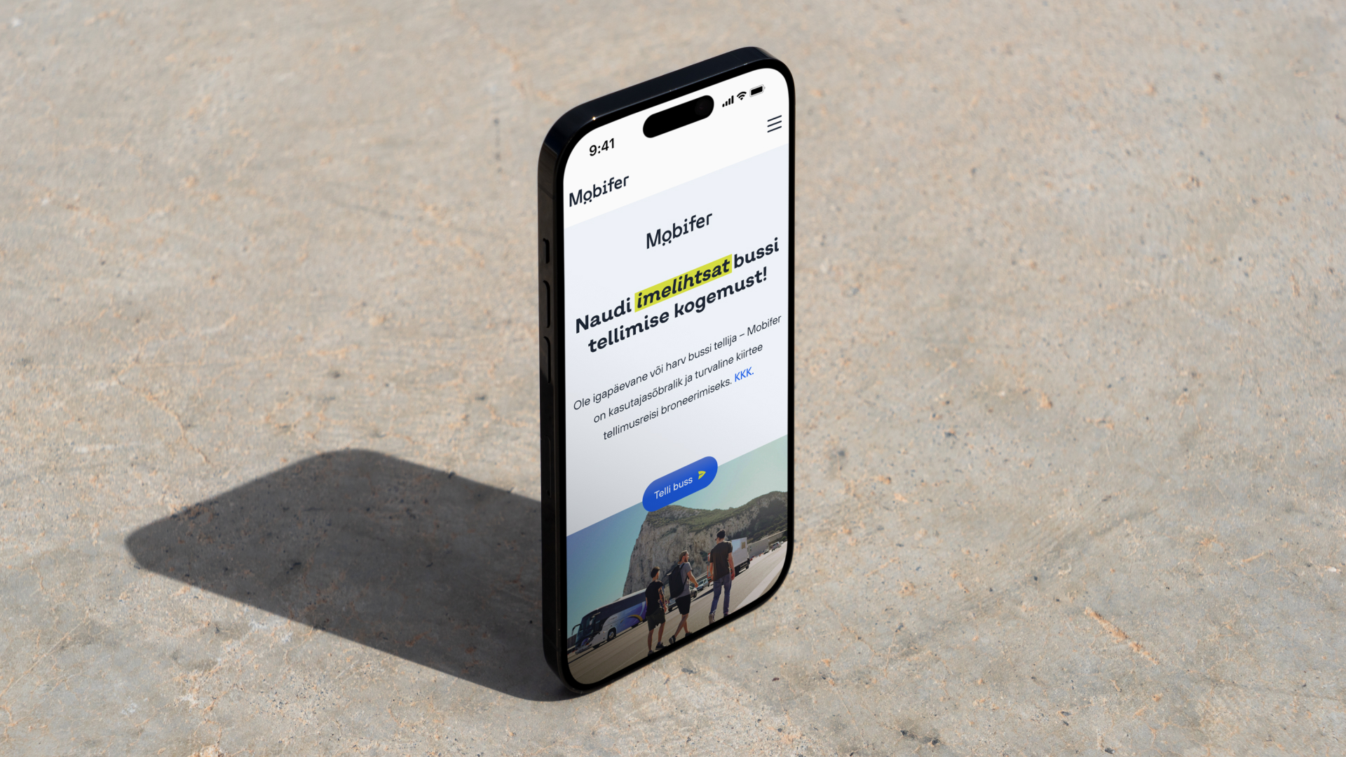
Your favorite bus companies in one place! Book a bus with just a few clicks!
Our approach
Brand strategy / Rebranding / Web analysis and strategy / Creating new website design
Client
Hansa Technologies OÜ
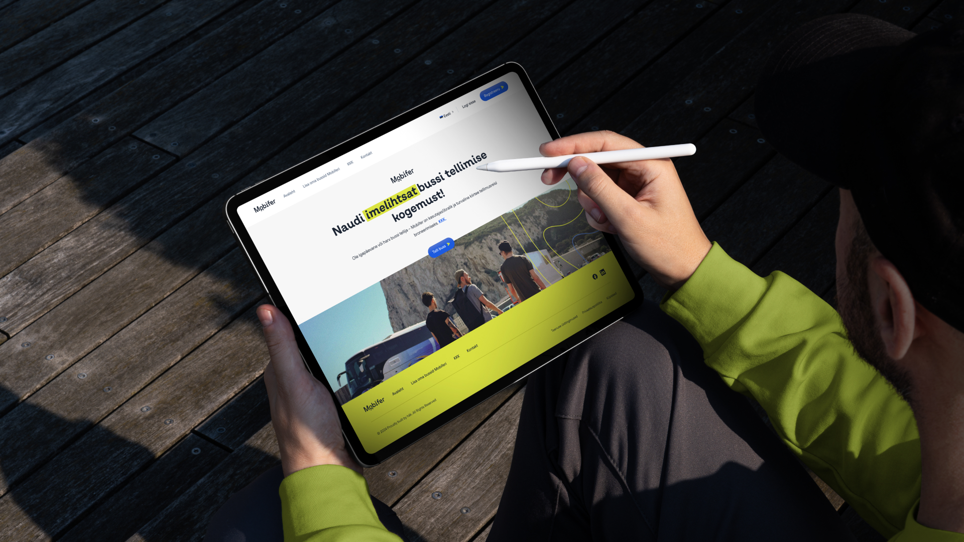
Mobifer, a web-based platform offering bus booking services, approached us to help them refine their brand identity and improve their website’s user experience. They needed a clearer strategy to position themselves in the market and differentiate from competitors who only offer basic contact forms for bus bookings. Mobifer wanted to stand out as a faster, web-based platform that also provides a vital tool for bus operators to find work. Similar to other ride-hailing services like Bolt and Uber but just for coaches and minivans.
Challenges:
Instead of focusing only on visual rebranding, we developed a comprehensive brand strategy to help Mobifer build its identity and connect more deeply with its audience.
A strong brand is essential for ensuring long-term success. A strong brand is recognizable to the user, carries trust, and creates strong emotional connections with the target audience.
We held brainstorming sessions with the Mobifer team to understand their core values, target audience, and business goals.
Using insights from these sessions, we conducted an in-depth analysis of Mobifer’s market position, competitors, and unique selling propositions (USPs).
Based on our analysis, we created a detailed brand strategy, positioning Mobifer as both a customer-friendly booking platform and a vital tool for bus operators. We established their brand archetype as the "Magician," emphasizing innovation and ease of use.
After developing a thorough brand strategy, we moved into the rebranding phase, which was essential to visually and conceptually align Mobifer’s identity with its strategic goals. This phase involved the transformation of Mobifer’s visual identity, messaging, and overall user experience to reflect the company’s core values of innovation, simplicity, and trustworthiness. Here’s a detailed breakdown of the rebranding process:
The updated visual identity focused on conveying Mobifer’s core brand values – efficiency, innovation, and user-friendliness – while ensuring that the design elements were distinctive and memorable.
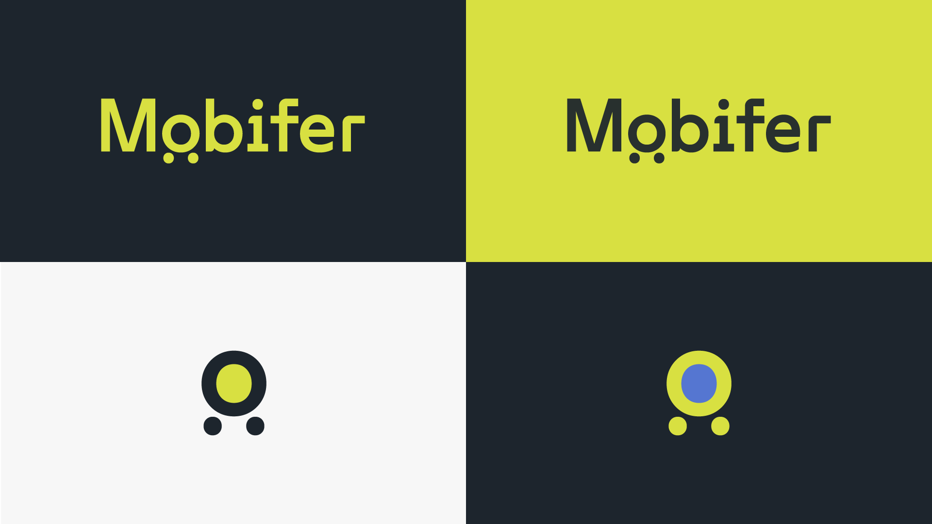
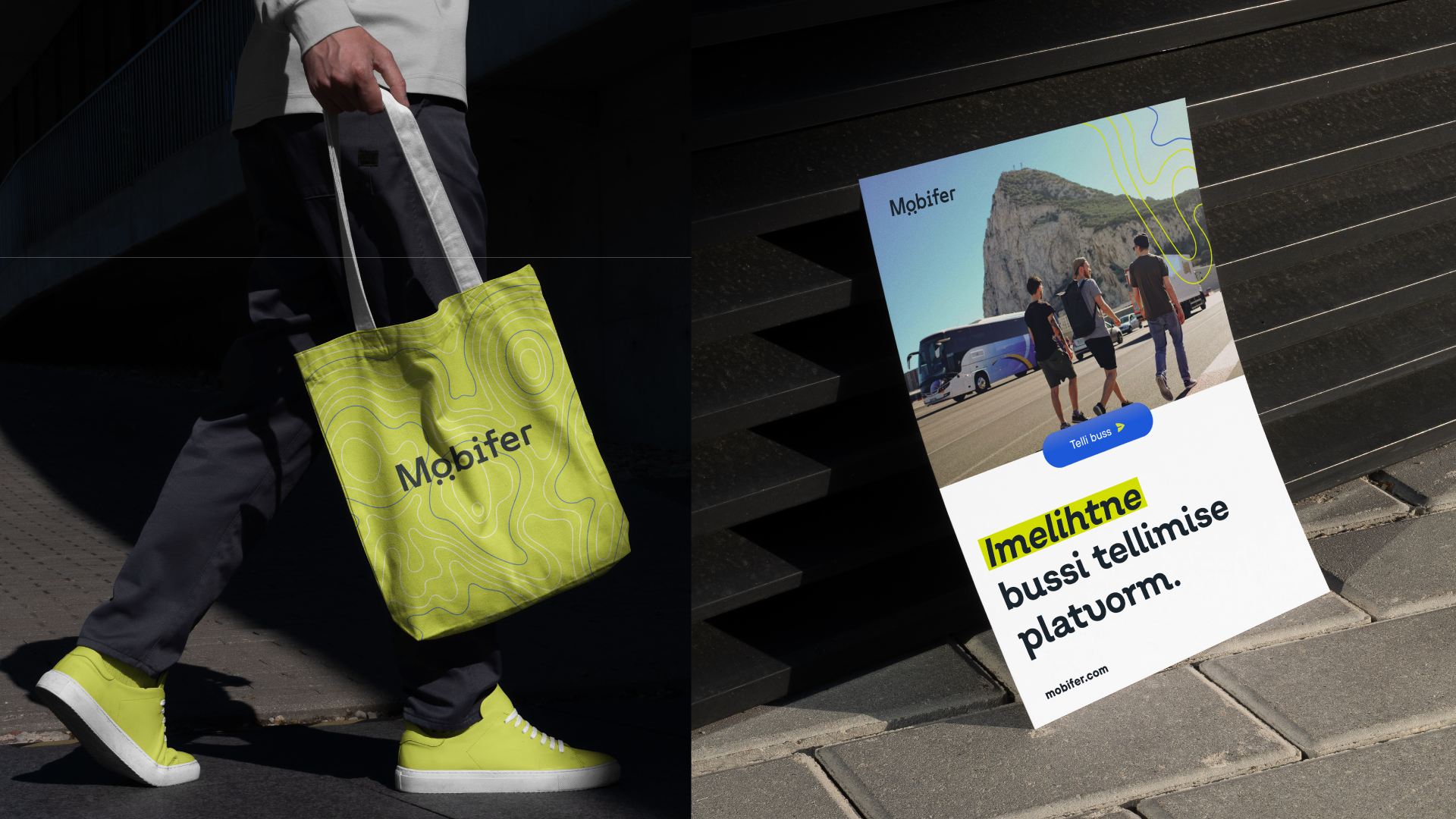
The new Mobifer logo featured a clean, modern design that represented motion and connectivity. The “O” in Mobifer was designed to resemble bus wheels, symbolizing movement and travel. The simplicity of the logo made it versatile and adaptable for various applications, including digital and print media. The logo’s design encapsulated Mobifer’s mission: to make bus booking effortless and efficient.
The rebranding introduced a balanced color palette that combined energetic and calming tones. The lime green symbolizes freshness and innovation, while the blue represents trust and reliability. Dark gray is used to add professionalism and authority to the overall brand image. Together, these colors ensure that Mobifer would be seen as both a forward-thinking and trustworthy partner.
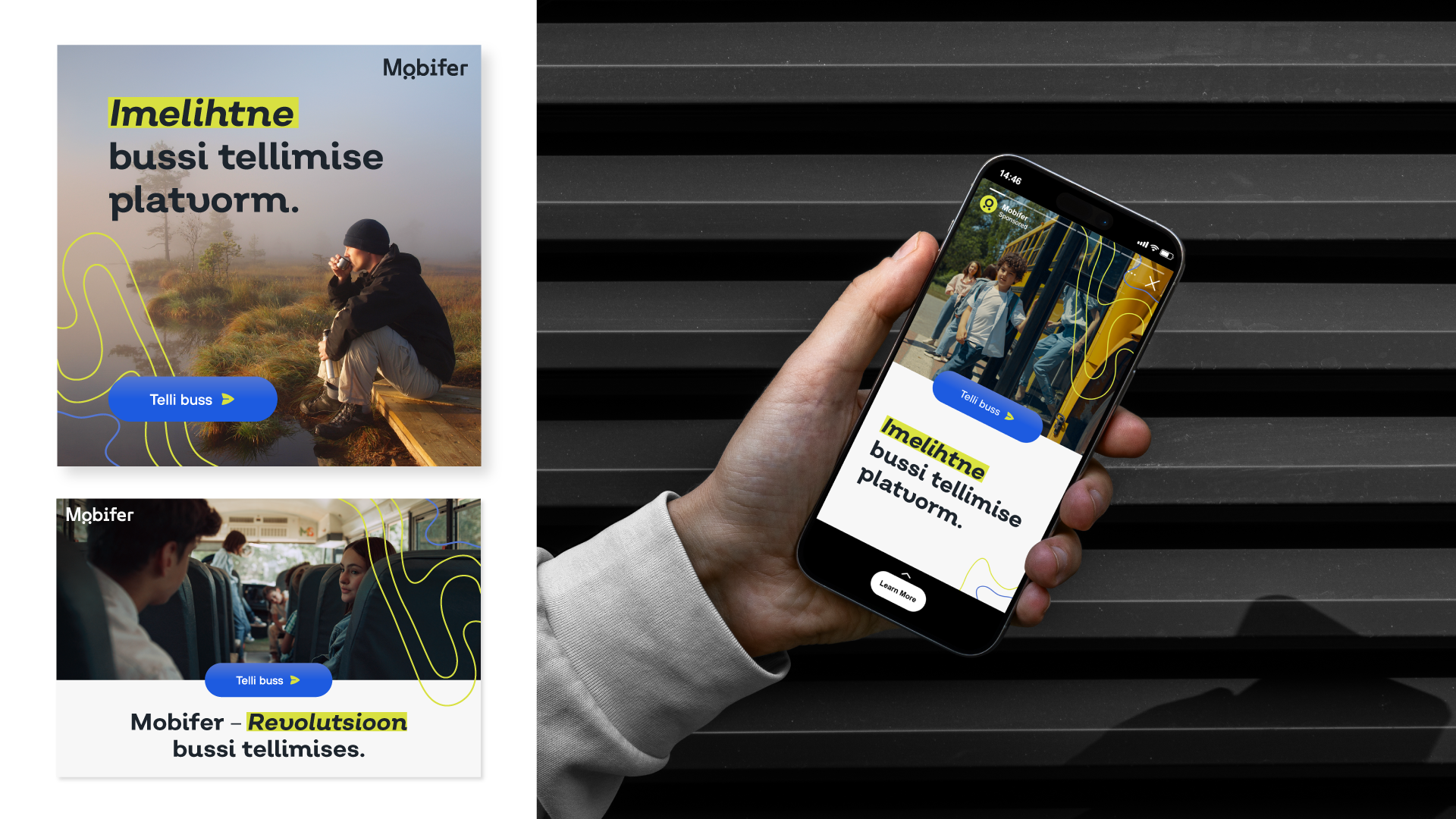
Mobifer’s new image strategy was centered around cinematic, film-like photography, capturing authentic, warm, and engaging moments from bus journeys. The visual style emphasizes storytelling, making every image appear as though it was part of a larger narrative. This approach adds emotional depth to the brand, helping users associate Mobifer with meaningful, shared travel experiences.
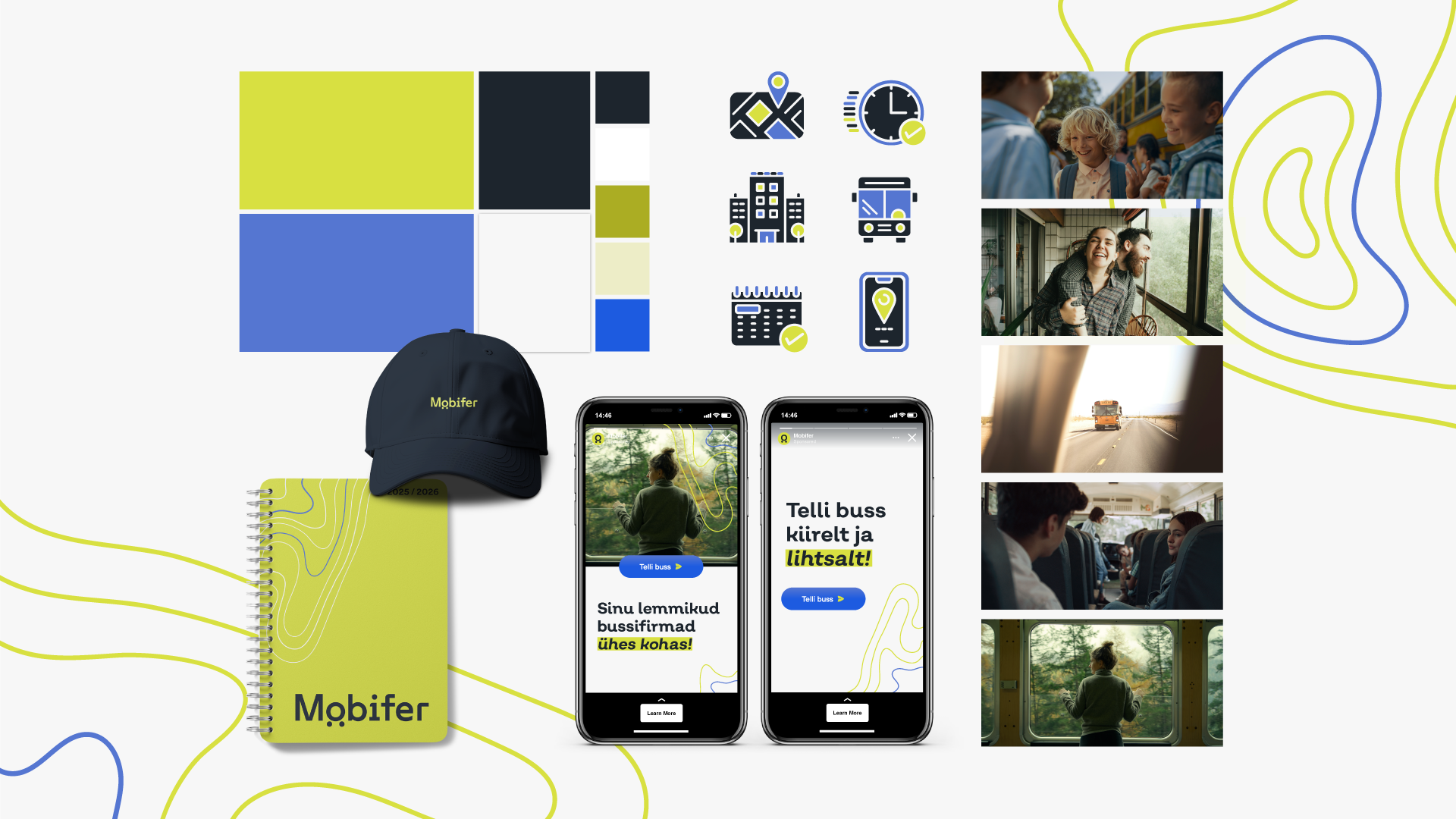
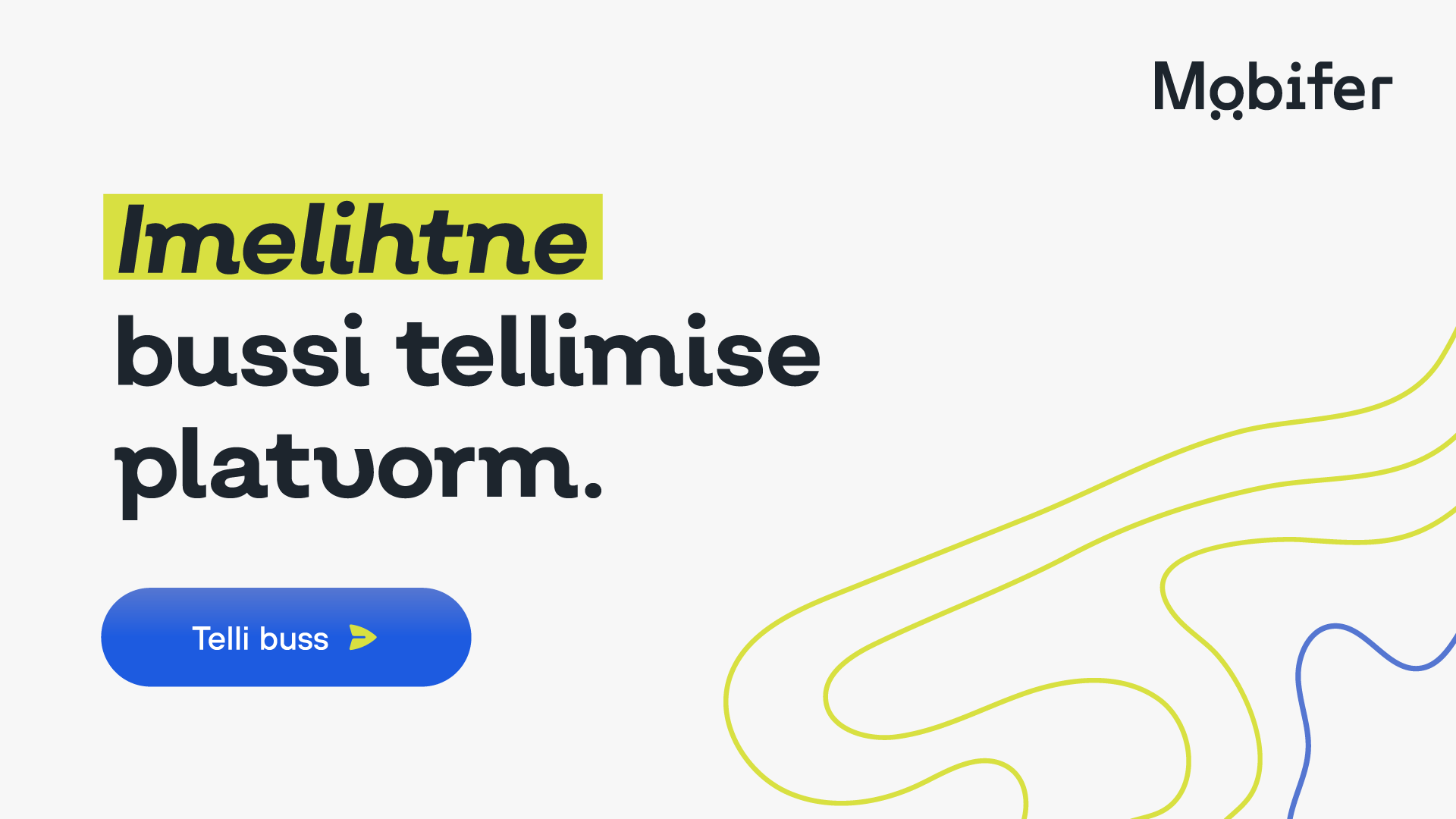
We developed a unique set of icons and a brand pattern that could be used across Mobifer’s marketing materials, from digital platforms to merchandise. The abstract, topographical lines of the brand pattern represent transportation and movement, adding a playful yet professional touch to the overall brand aesthetic. These elements help create a cohesive and recognizable visual identity across all touchpoints.
Along with the visual overhaul, we ensured that Mobifer’s messaging was clear and consistent. The tagline “Imelihtne bussi tellimise platvorm” (“A magically simple bus booking platform”) became central to the brand’s communications, reinforcing the ease and speed of the booking process. The tone of voice remained approachable and professional, speaking directly to both casual users and bus operators.
This rebranding phase set the stage for the final step of the project—an in-depth UX/UI audit and website redesign—ensuring that Mobifer’s digital presence aligned with its new identity and provided a seamless experience for users.
Once the brand strategy and identity were established, we focused on improving the website’s user experience to make the bus booking process even more intuitive and seamless. Analyzing user needs and habits provided us with valuable insights, which we used to design solutions that make the platform easier to use for both individual customers and bus operators.
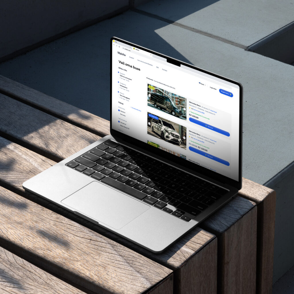
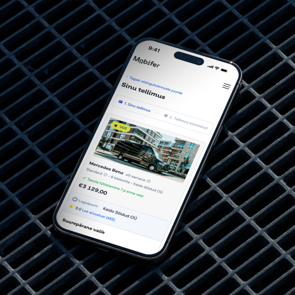
Key UX/UI Enhancements:

As I think back on the process now, I feel it was a bit like introspection for us too. We all have a huge number of ideas and quite often they get scattered and we lose track of what is important and what is not. I believe that it helped us set goals and make them specific.
I could say one of the biggest benefits for me was the focus and analysis – knowing your persona inside and out and knowing what he really needs.
Outcome:
The project is still ongoing, and while specific metrics have not yet been gathered, Mobifer is already seeing positive responses to the updated brand positioning and website. The refined brand identity and enhanced user experience are expected to yield the following benefits:
The new brand strategy will help Mobifer stand out as the go-to platform for bus bookings in Estonia, offering clear advantages over competitors. The redesigned website, with its more intuitive user flow and engaging content, is expected to increase user engagement and improve conversion rates. By positioning Mobifer as a tool that helps bus operators find new clients, the platform will strengthen its appeal to operators and grow its network.