Kurna Park – Case Study
How to Make a Brand More Modern and Recognizable?
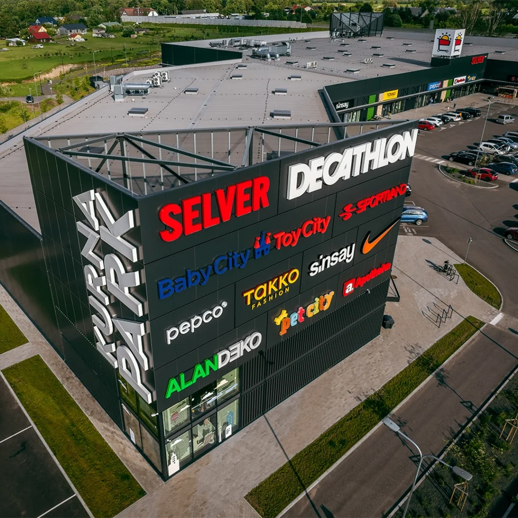
Kurna Park is a family-friendly retail park located just outside Tallinn, next to IKEA. What makes the retail park unique is that each store has its own entrance and visitors can park right in front of the door — a fast and convenient solution for families and active people.
However, despite these strong advantages, Kurna Park’s brand remained modest in the market landscape and failed to stand out from competitors.
18%
Increase in footfall in 2025
Strategic and measurable work delivers real results that can be tracked thanks to clearly defined KPIs. Since the start of the collaboration in September 2023, häk agentuur has increased Kurna Park’s footfall by 10–20% each year.
How We Helped
Brand Strategy Development
We mapped Kurna Park’s strengths, target audiences, and market position, and defined an archetype that captures the essence of the retail park.
The chosen archetype was The Innocent – honest, clear, and family-friendly.
This strategy provided direction for how to tell the brand’s story consistently and authentically, helping to build an emotional connection with the target audience.
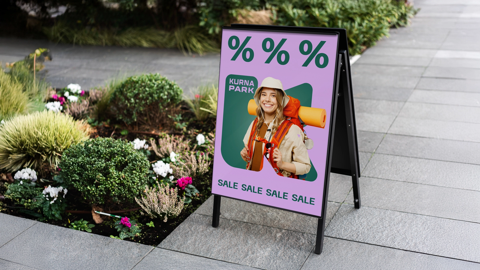
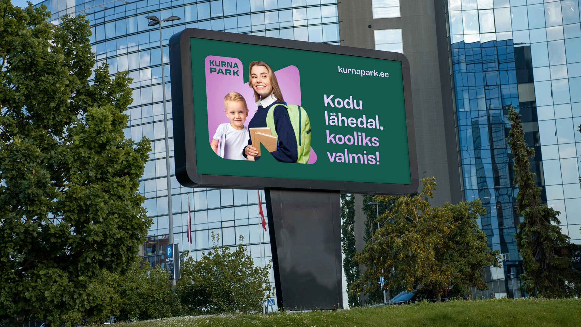
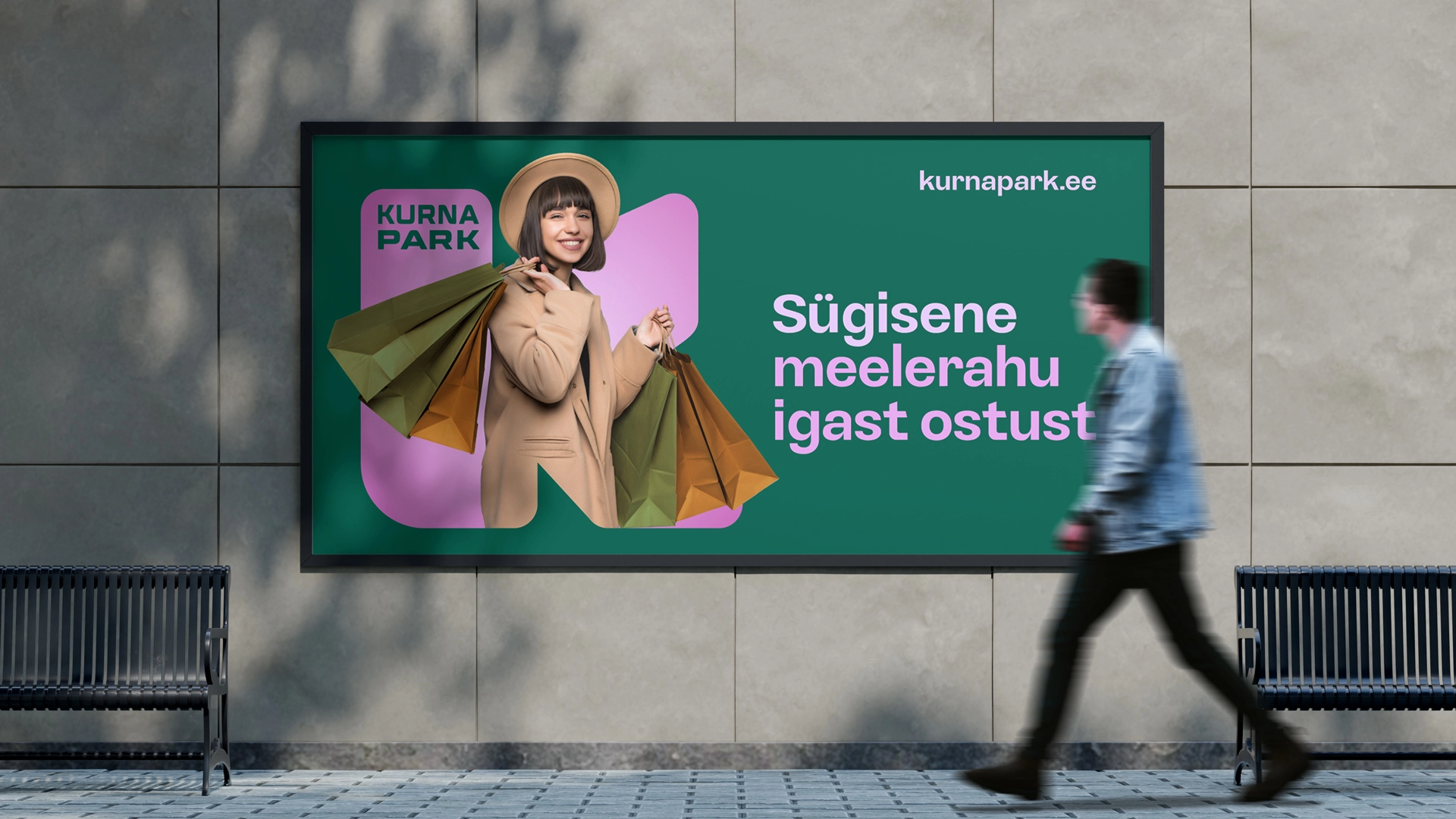
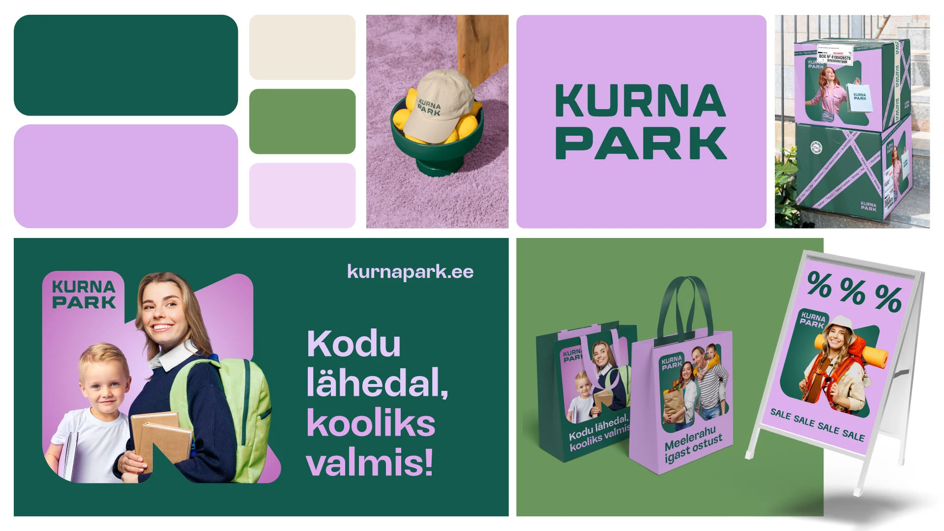
CVI Renewal
The goal was not to create an entirely new look but to make thoughtful, subtle updates that would make the brand more modern and recognizable.
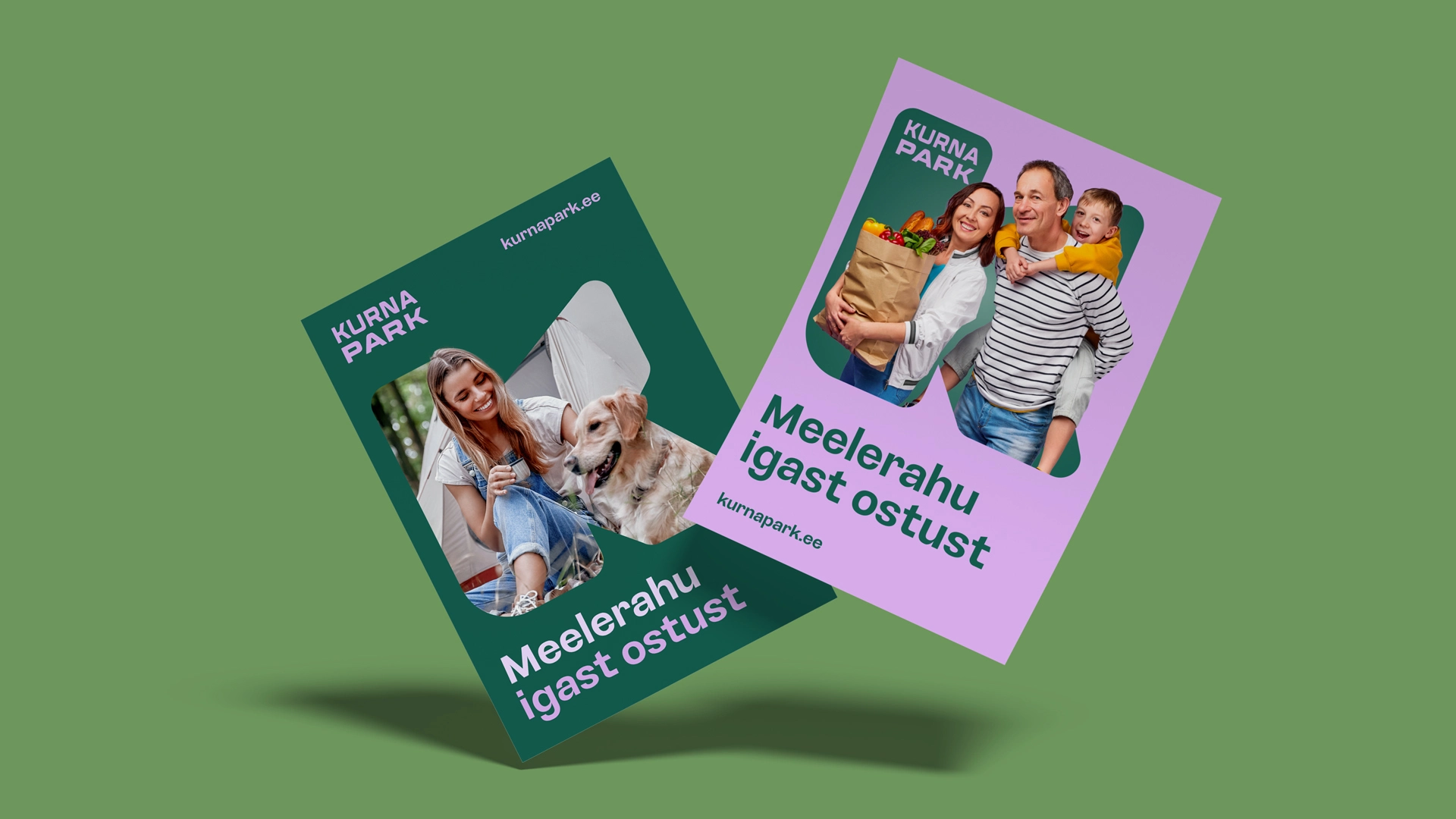
We refreshed the color palette and typography, simplified logo usage, and developed a clear visual language.
The combination of green and lilac visually sets Kurna Park apart from other shopping centers while maintaining a natural simplicity and calm tone.
We also created a new slogan — “Peace of mind with every purchase” — which encapsulates the brand’s value proposition: everything you need in one place, quickly and effortlessly.
Results
- Kurna Park gained a modern and distinctly recognizable visual identity.
- Brand communication became unified and resonates more effectively with families and active individuals.
- The renewed CVI provides a strong foundation for future marketing campaigns and events.